

A Data-Driven Visualization User Group Got Me Thinking
I went to a data visualization user group meeting here in New York last week where three presenters showcased some of the techniques using D3 – a popular Javascript library for bringing datasets to visual life. There was a certain tone or theme to the presentations that struck me even though the subject matter was quite varied. And that theme was a bit different than when I present traditional print infographics. And so I started to think about the differences between the two visual solutions …
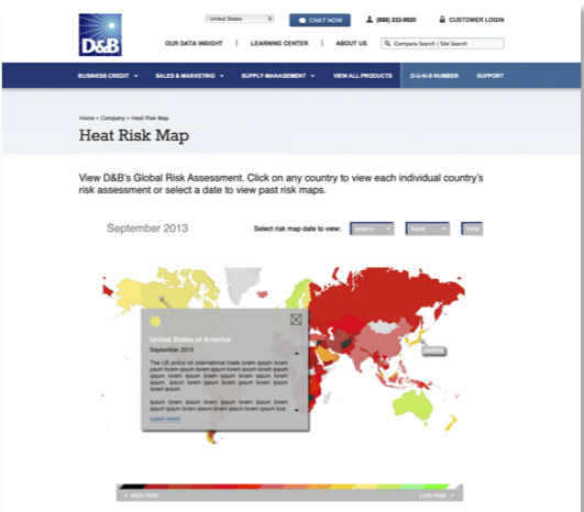
A Sample of a Data-DrivenVisualization done by Frame Concepts – D&B Global Risk Map
Can We Say Perspective?
The presentations reminded me of conversations with artists and their thoughts on making an impact with their audience especially in the conceptual art world. One of the their goals was to cause them to think or feel or even act differently about subject matter. And the presenters seemed to be after similar goals. One presenter had used a map library to show the amount of property taxes building owners were paying utilizing a color coded map outlining each building on the streets of Manhattan. The purple buildings paid no taxes. The presenter hovered over some of the purple buildings and each of them were churches. He suggested that this might cause thoughts on the fairness of tax allocation and it certainly gave you in one eyeful the relative distribution to high and mid and low-tax payments across the manhattan landscape. A second presentation showed with a bubble diagram the New York City budget allocations. Very tempting to hover the large bubbles that dwarfed the other bubbles combined to see where our taxes were going and of course hover over the minute bubbles to see who was receiving so little budget. In both of these cases and other presentations, it became clear that the presenters were proud of their work – partly because of the technical adaption of the libraries (it was a D3 user group) – but more because it caused the viewer to think about the subject differently. The dynamic eyeful reset a preconception.
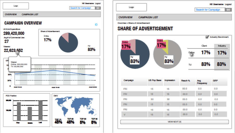
Sample of Dashboarding Done at Frame Concepts
But Don’t Infographics Do the Same Thing?
Difficult to generalize over the broad range of infographic types and purposes including the broad range we do here at Frame Concepts (https://frameconcepts.com/solutions/) . But in general as a pattern, I noticed that our print infographics tend to make an argument and use the data and the visual portrayal as a step in that narrative to drive a particular conclusion. Perhaps then the difference is the editorial heavy-handedness of the classic infographic. But considering the presentations at the user group meeting – there still was an axe to grind – but the presenters with artful and technical setup of the D3 libraries hoped to get that new insight reaction generated by the data itself. The viewer of the infographic does have a sense of being taken for a visual editorial ride by the infographics artists interpretation of the data.
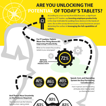
Cropped Sample of Traditional Infographic
Which Method is Better?
As you can imagine – its all dependent on business goal and application at hand. But rather than totally bow out of the question – I would like to offer some merits to each approach. Starting with the infographic – typically there is a clutter of data or a new point of view or an undesirable preconception that needs to be addressed – and a well laid out narrative with compelling visual storytelling can bring the reader over the conceptual hump (i.e. Our Company name is Frame Concepts). And if done in a visually engaging manner, its a fun ride. You get your audience to appreciate the case being made and they have a smile on their face during the visual ride. But the data-driven visualization is more like a hammer. Its just data. The audience perhaps has seen the data in spreadsheet or traditional charts – so you are not offering new facts. But a clever application of the data-driven visualization brings the data into a different light – a different perspective – and they now have a new insight. And perhaps off that new insight they would like to create an infographic to make an extended argument to a new course of action. And sometimes the visceral reaction to a well-chosen application of a data-driven visualization is enough to cause not just a new insight but a new course of action.
Best of Both Worlds – Infographic Data-Driven Visualization
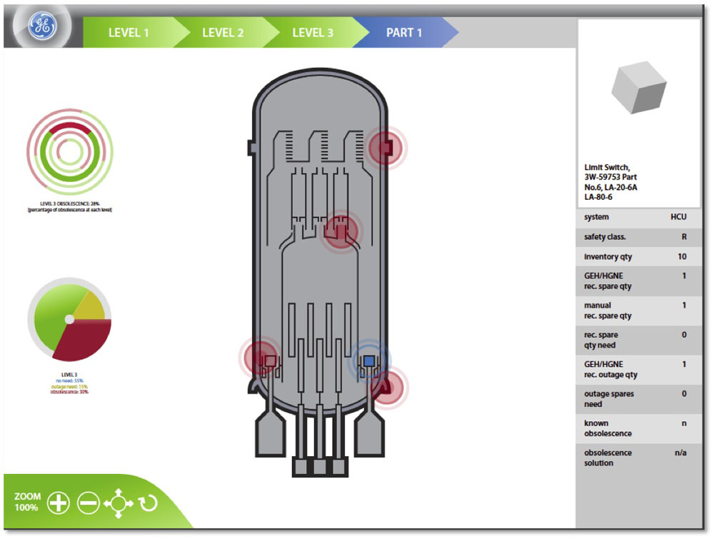
Blend of Iconography of Nuclear Reactor and Data-Driven Visualization for GE Nuclear Spare Parts Program
I realize this might be a bit self-promotional for a blog post but its fairly cutting-edge and represents an interesting angle on this topic. Well we are not forced to choose between these approaches – the Frame Labs is rolling out data-driven visualizations while integrating our custom information design – we still start with pencil sketches. So our clients now have the ability to leverage dynamic visualizations using Javascript libraries like D3 or R-chart but can integrate iconography, infographics and custom illustrations and user interface controls. The exact blend of data visualization library tools and custom illustration work is decided on a case-by-case basis. But the net effect is that immediate impact of the actual data presented in novel visual way coupled with integrated infographics can produce both the “hammer” effect of the data insight while bringing your audience into the desired “ah-hah” of the conclusion of your visual narrative. We can have our cake and eat it too.
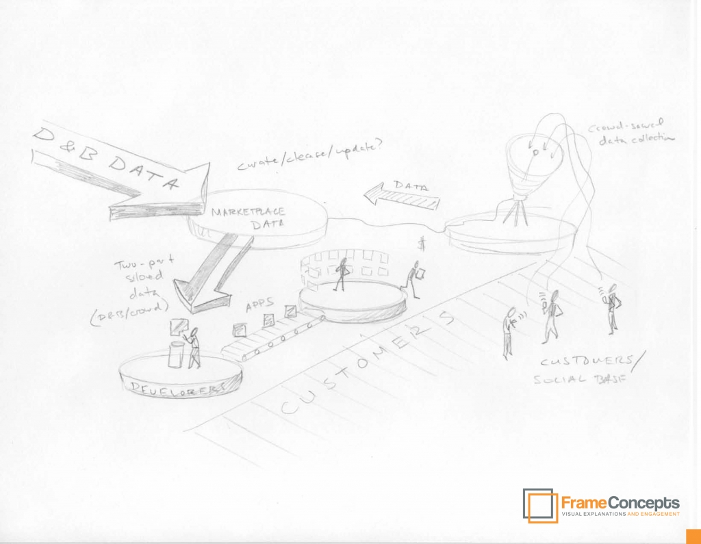
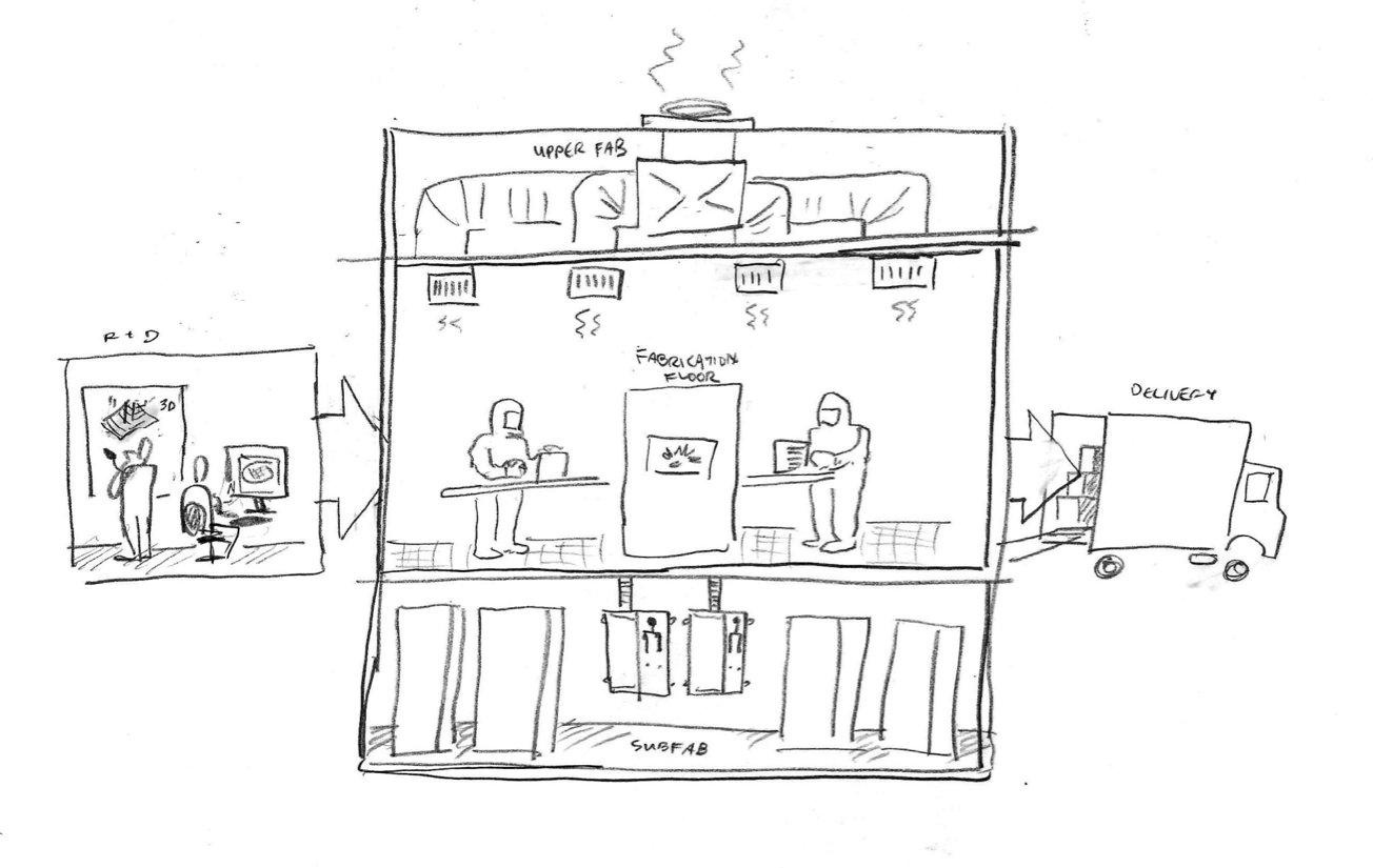
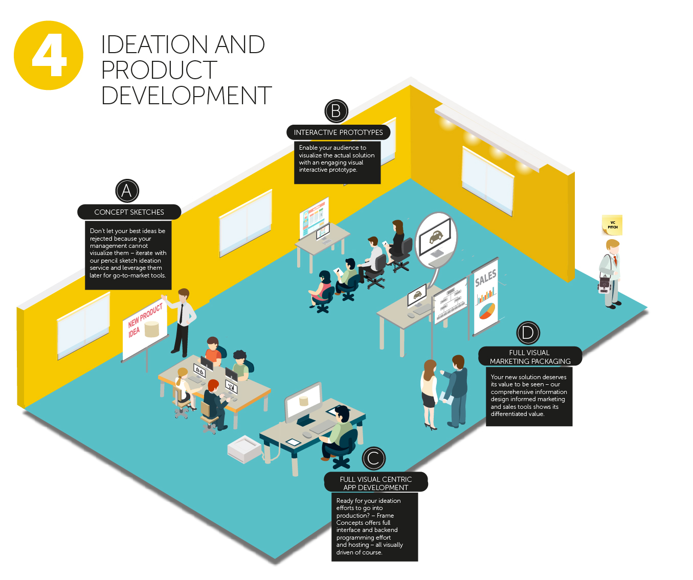
The Pencil Sketch Ideation Process Still Drives the Conception of our Data-Driven Visualizations
If you could like to see a demo of our integrated infographic data-driven-visualizations and brainstorm on your communication needs, please click here for a free demo and consultation.

