

I Got A Bone To Pick
VERY biased opinion here as I am steeped every day in visual solution consultation and delivery every day. But … when I go to websites of even the most well-heeled Fortune 500’s and I go look at their website to understand their offerings – I am almost invariably pushed into heaps of text and one stock photograph (sometimes stylized photos and sometimes not).
Do You agree?
Sometimes I get a break and there is a bullet list of features or services or perhaps a table which is easier on the eye and makes me think I might be able to get through yet another page. But at the end of day (getting to my thesis here) – I am challenged to come to terms with what they do, how they work and what is the actual deliverable and why I should care.
This is What I am Talking About
Here is a generic sample (names hidden to protect the innocent) that I think is indicative of corporate websites – a stock photo – in this case a photo of a pencil with spreadsheet to indicate the topic is finance and then dry bullet list of features. But this is actually better in that they at least broke the paragraphs with titled bullet points and there is some white space. It can and does get much worse.
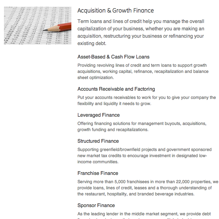
Typical Stock Photo and Copy Combo
Where’s the Meat?
But its a fair question (it really is!) for a web visitor to know what makes you different, the logic behind your differentiated approach and how it will serve my contextualized need. You want the web visitor loaded with intention and not an idle web surfing cruise right? And the sad tragedy to all of this stock photo and text plague is that these answers can be provided succintly – visually. I am talking about visual solutions – infographics, interactive solution pictograms, animations (not the cheezy clip art type) and the burgeoning world of dynamic data visualizations which we are excited to be at the forefront of.
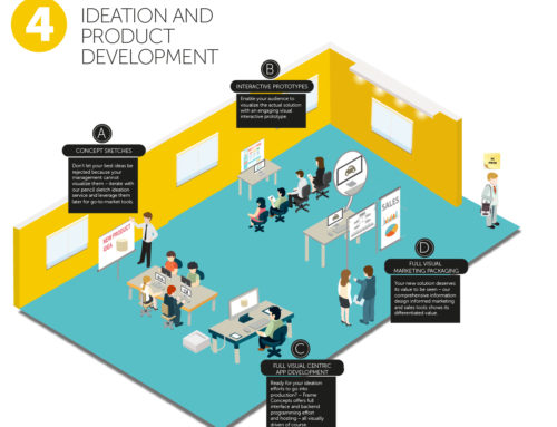
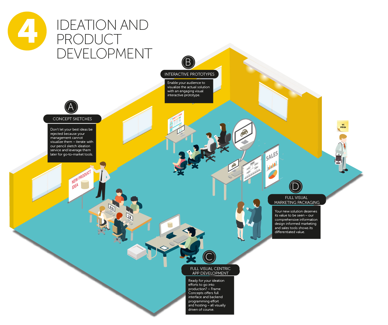
Lets See it in Action
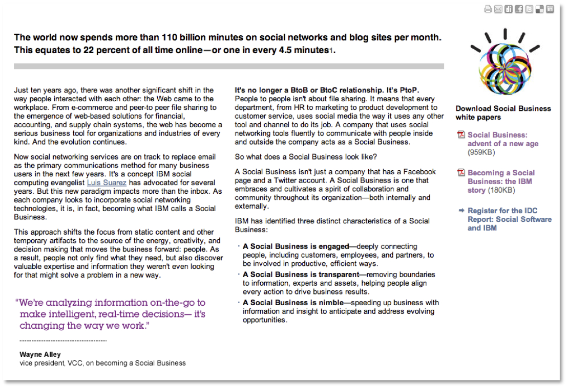
Here is web page from a Fortune 500 in the IT space (that I use to work for), that I took to task for being over-textual and lacking in engagement attributes despite the one nicely branded style icon on the top right.
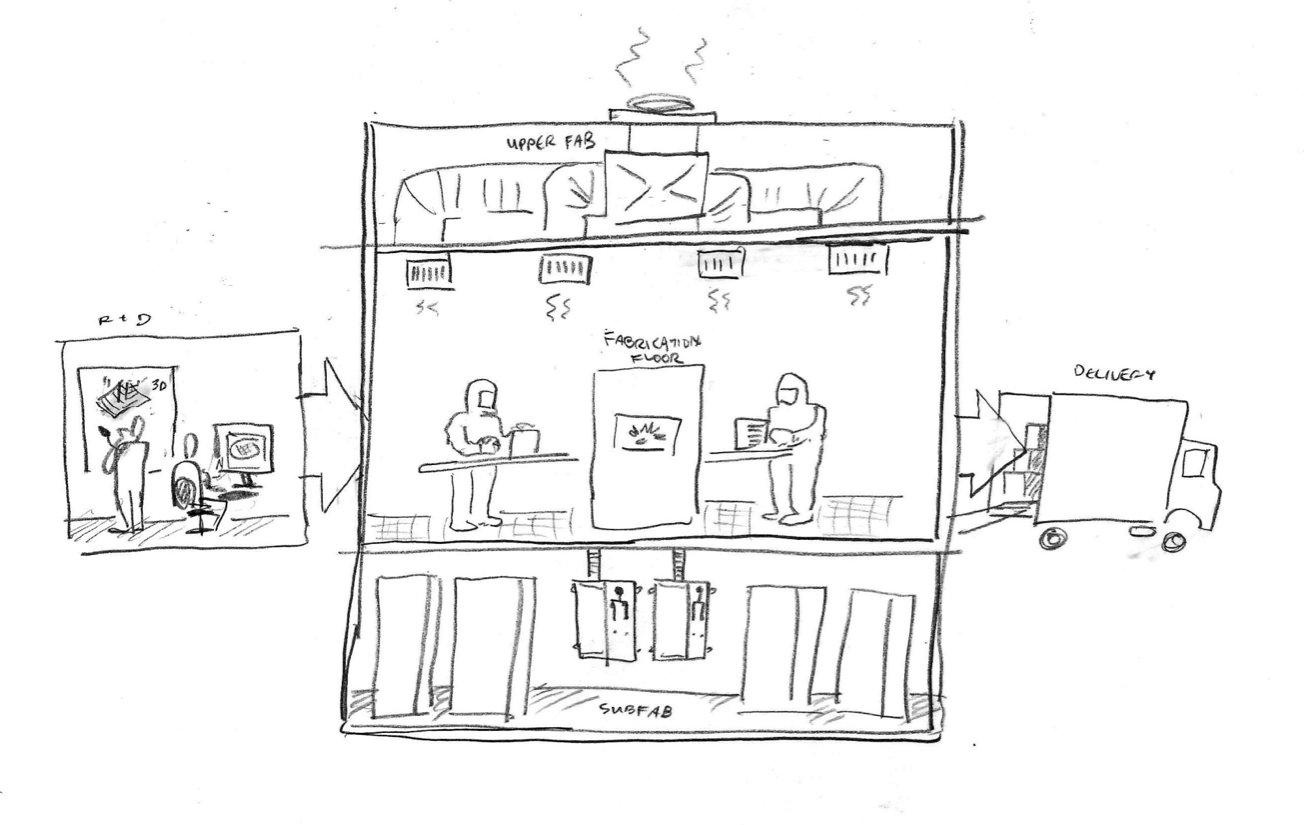
And here is how we in the pencil sketch form starting bringing the value lurking underneath the text to visuals with fanciful analogies.

Sketch Development Off of Website Copy
And So I Thought About a Maturity Model … I actually came up with this in 2010 when I was forming Frame Concepts – I wanted to visualize to myself (perhaps to convince myself) that there was a gap. And so on one side in the consumer, sexy advertising world their was an abundance of stylish sexy ad type pieces getting one hot and bothered about a new car model or aftershave product; then in the more B2B world, if you wanted to explain how a complex technical or consultative offering works the medium of choice, was a technical guide or loads of slides with bullets and the occasional stock photo or clip art.
So one was forced to choose with the visually compelling but lacking in content substance on the advertising consumer side and the robust technical manual or slide deck without an ounce of engagement factor. This is four year olds now and I need to refine it but its get to the point at hand:

Frame Concepts Maturity Model
As you will notice in addition to working the contrasting continuum, I also suggestively worked out where and why visual solutions may play a role. One afterthought amongst others is that four years later I think understated this and would suggest that the advertising could use of a dose of explanatory visualization and the process pictograms could even do more on the client technical communication front on the far right.
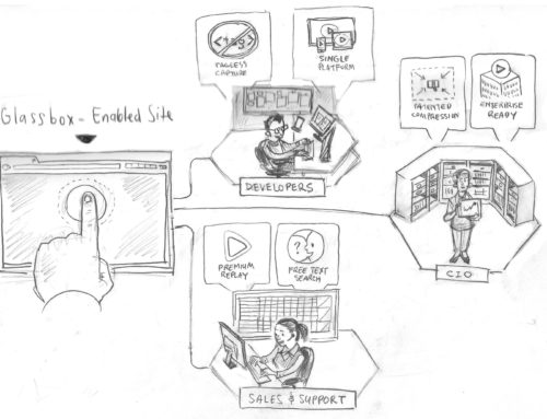
Visual Case Studies Make the Point Better Than I Do

New Frame Concepts Case Study Section in Website

Healthcare Industry Visual Case Study
Why The Rabid Rant Four Years Later?
What got me thinking about this is that four years later we have just released a major edition to our website – Visual Case Studies – with over a hundred visual samples showcased against Visual Solution Types, Industries, Professions and Organization types. It serves to expose this false dichotomy between dry technical guides and sexy consumer advertising and this plague of boring text with stock photos under the cold light of reality – and quite simply and overwhelmingly concludes through expample that in fact this a very resolvable problem.
It visually makes the case for a visually-centric communication solution. And I am very excited to have been a part of it and look forward to advancing further in 2014 with new emerging visual solutions developing for market as we speak (See you on the next Case Study Update which I am sure will spur other thoughts.)
You can review the case studies here
If you would like to receive a live demo and consultation, please click here – Free Demo and Consultation.

