

Its Organic to Encapsulate with a Visual
I was thinking the other day about how at all the startups I worked at on the client side that there was always a key slide with a visual that the sales team used when pressed for time and they needed their audience to get the point of a complex offering quickly.
We usually had a name for it because we would use it for a lot of purposes – certainly in a sales presentation and also in the boiler plate of a proposal and also for management meetings to try and get our VC’s who put millions into the solution, what exactly they had invested in and also for the employees to get them behind the vision. We had a name for it – I recall one was called the spaghetti slide because it tied together a complex eco-system of partners with a software platform and it existed it one slide. It was done in powerpoint and looked a bit like a neon org chart. But it was our go-to-slide.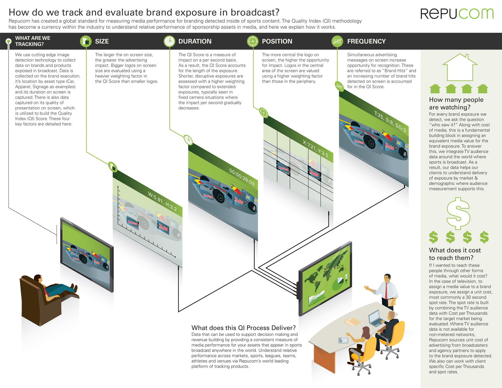
Getting Behind a Visual
I think there is something natural and right about getting your team behind a visual – especially the killer visual. It clears up fuzzy thinking and cements your team’s commitment to exactly how you deliver value in a succinct message. And if there is not really clear differentiated value – the visual exposes this fact (better to know sooner than later) – and causes one to come to terms with what the differentiators really or perhaps take a deeper look at the offering itself. But my experience is that its not a question of whether there is value lurking within but how exactly to communicate that and also, as strange as it may sound, how to come to terms what the value is for yourself.
All Visuals are Not Created Equal
There are lots of ways to do a bad visual. The easiest way is to overload it with text and then try to heal the damage with a stock photo or clip art that has no explanatory value and does not really integrate with the message at hand. For a large part of my client side marketing communications life – thats what I did. But you can also not help yourself with over reliance on an expensive branding and positioning effort from a brand firm.
I experienced that effort (no I am not revealing names) and got a 20 page document with logo treatment, tag line and a few positioning lines how we were a smart sophisticated New York tech company with high level of integrity and a commitment to transparency. The rest of the 20 pages were treatment suggestions for stationary and powerpoint templates and physical objects like a coffee mug. Far from the killer visual we needed to position to prospective beta clients on a solution that had not gone to production yet and we were living on VC funds. And of course the operating manual helps get the user onboard with using the system – but the task at hand was get the customer first.
Sketches and Whiteboards
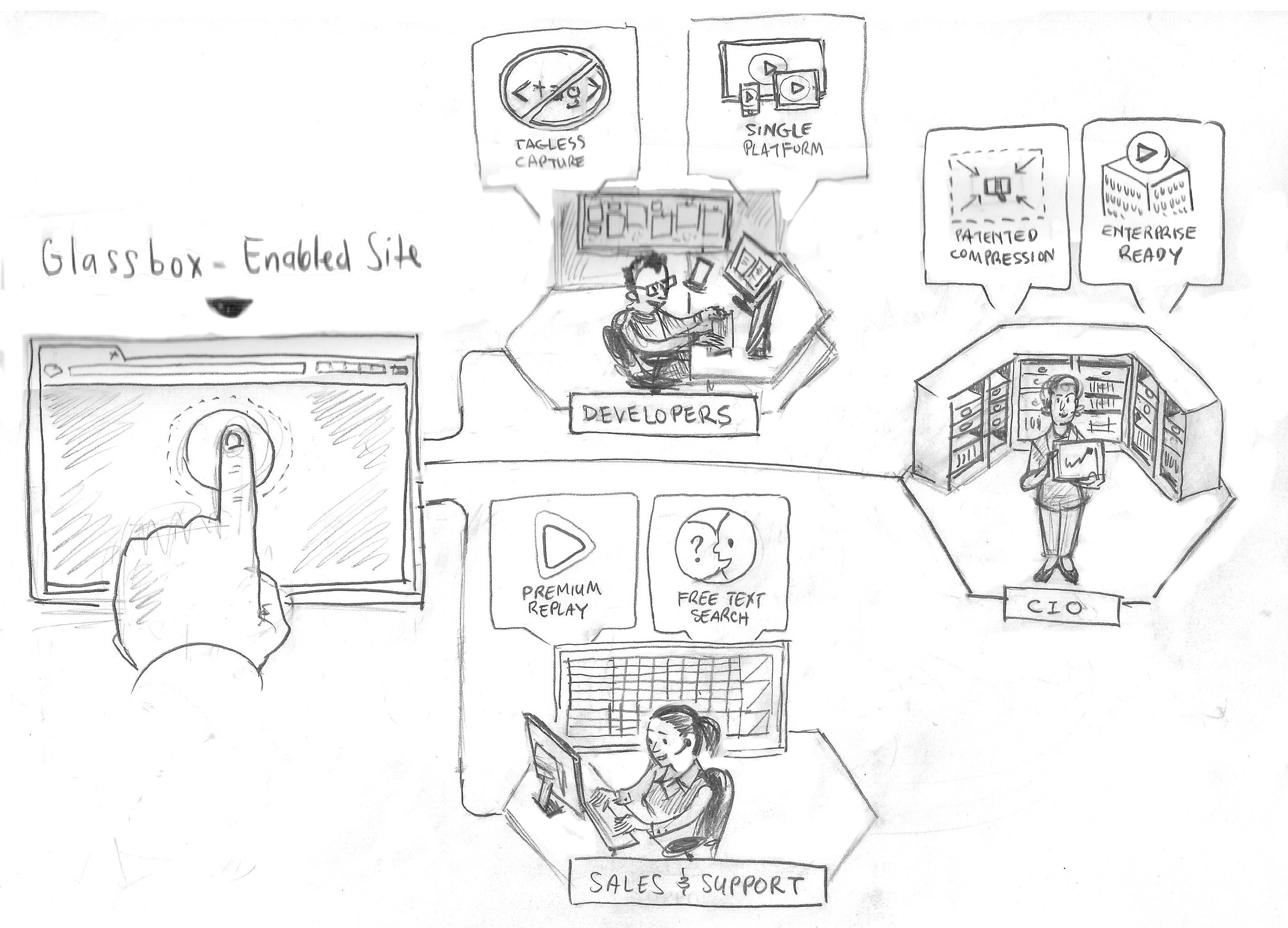
But I have noticed that it is very natural to go to whiteboard to settle what it is that one’s company does and allows the team to argue it out by gesturing to the visual or filling in missing sections on the sketch. I have noticed recently with smart phones in hand, its very natural to take a picture of the whiteboard so as not to lose the crystallization of the final visual conclusion.
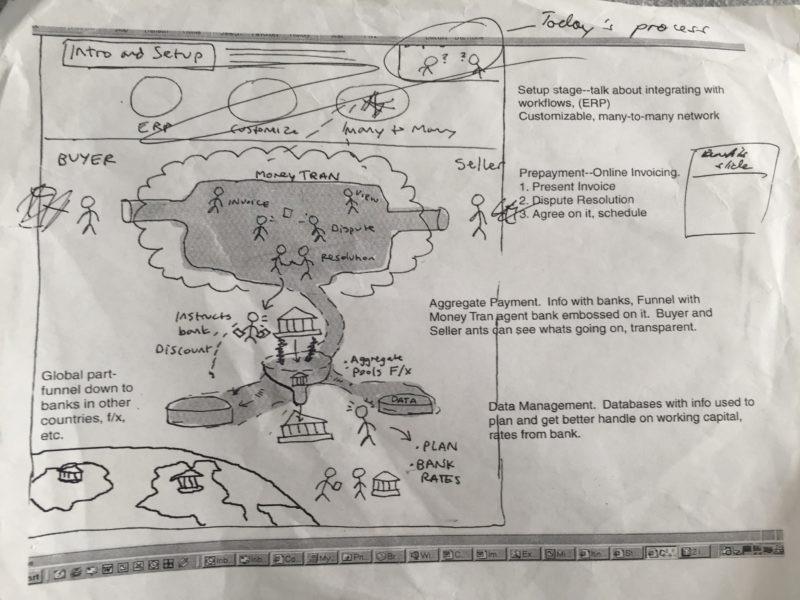
 Sample Pencil Sketch
But When We Go to Market, Communication Tradition Creeps In
And while we all enjoy the killer visual and it is quite often the formative part of developing the solution and the positioning, when we go to market, we quickly think of a “professional” website and “tidy” presentation slides and a technical data brochure. But the elephant in the room is the simple question:
Why would we not gift our marketplace with the killer visual, so they come onboard with your visual ride you have been on and get the differentiated value off one visual?
The sales team get use it on the executive debriefing table, the product team can use it to debrief analysts, HR and Training can recruit and onboard new employees, management can lead the company in their town hall and intranet site with it and client and customer support can reinforce delivered value to all their clients staff with it. Not bad for one killer visual that can fit on the back of a cereal box.
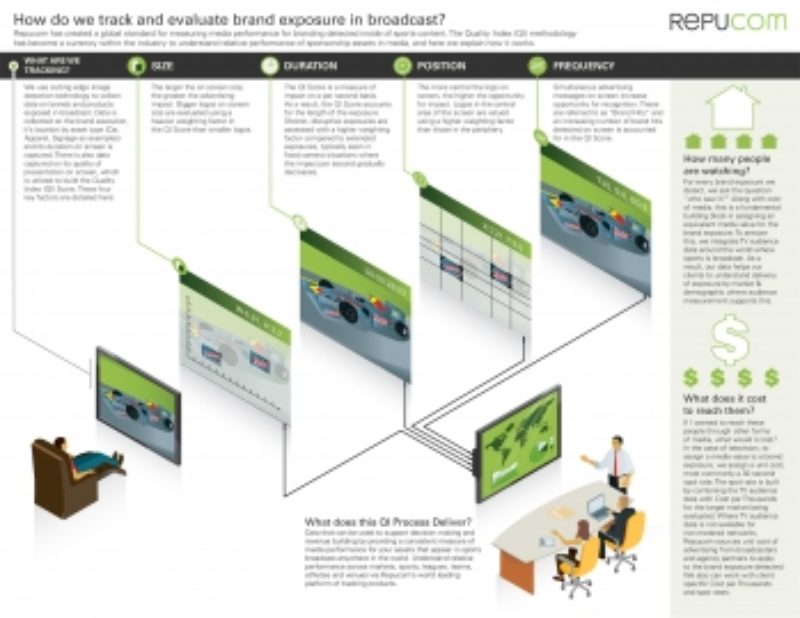
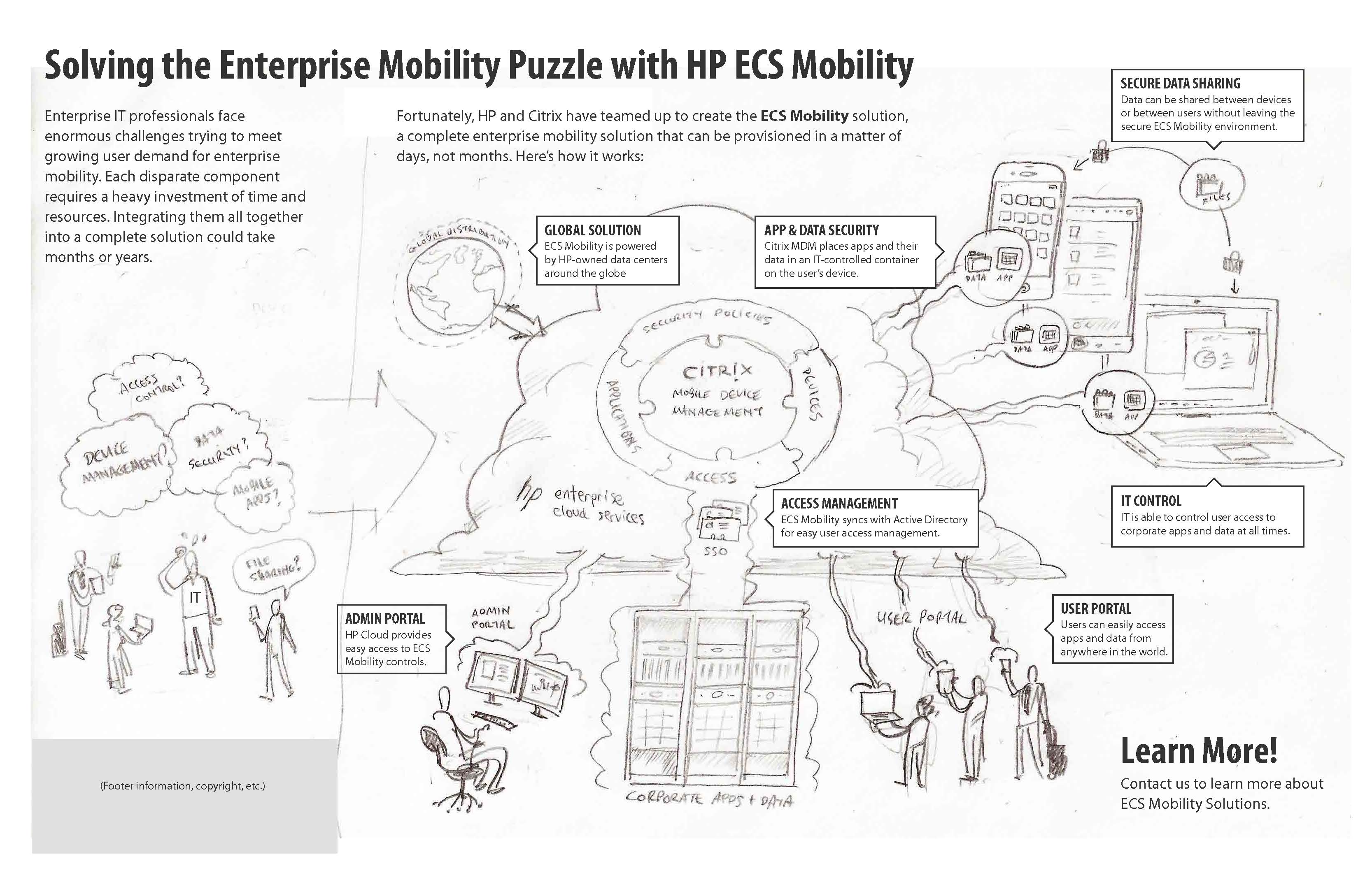
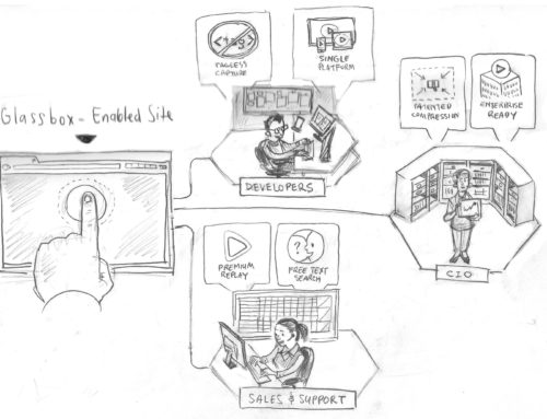
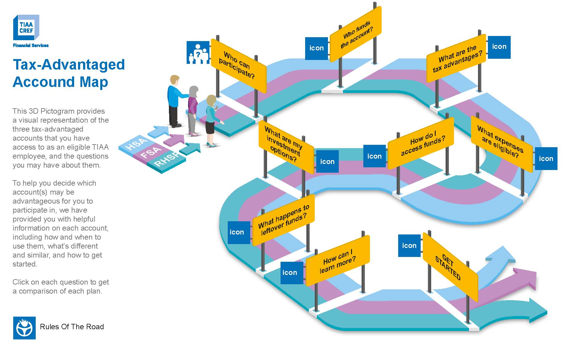
 One Page Visual
At Frame, Our Clients are Seeing the Light
We are happy to see that even in the ideation phase of new product development, our clients are getting behind their own crafted visual and seeing it through in presentations, websites, animations and now into the user interface of their products. We get to experience the fuzzy state and then the intuitive and engaging state and its quite remarkable the before and after. Information design is the craft for bring this organic business practice to life and packaging into visuals that bring your company and your marketplace onboard. And its a solution I wish I had when on the client side I was trying to come up with the “killer” visual.
If you would like a demo of “killer” visual solutions in practice and free consultation about your communication challenges, please click here – Free Demo and Consultation.
