Cisco Connected Learning Blueprint
A picture is worth a thousand words. We’ve heard that said often and indeed it is a tried-and-tested maxim of traditional marketing. As such savvy marketers are paying much more attention to the info-graphical presentation of content in their marketing campaigns, sales kits and business proposals. In case of marketing complex solutions or conveying technical data to a non-tech savvy audience, infographics can and often do play a really major role. According to ‘Artist with an MBA’, Cliff Atkinson, designed and used properly, infographics can:
- Help a prospective client understand a concept quickly.
- Show respect for the viewer’s visual sophistication.
- Serve as an elegant visual interface to your quality content.
- Motivate readers to dive into the text to find out more.
- Show you care to craft a compelling visual story out of your content, rather than use a cookie cutter approach.
Modern infographics started off as visual elements such as charts, maps, or diagrams that aid comprehension of a given text-based content. Today – in the context of marketing, we can also include process diagrams, concept maps, visual narratives, simulations etc., under infographics.
The Challenge
Cisco Systems had this brilliantly designed network architecture and framework for educational institutions called Connected Learning. To present this to the administrative and IT management of an institution however required presenting a deck that was 200-slides too heavy, and technical documentation that would take months to read, let alone digest. They needed something that would help everyone from their prospective customer organisation, CEO and dean to CTO and IT managers get the big picture and appropriate level of detail in minutes.
The Solution
GetIT designed and developed an infographic that explained the Connected Learning infrastructure using a typical campus layout as a foundation graphic upon which various levels of details were added, to literally bring everyone on the same page.
The process, while straightforward, was fairly involved. We collected the core content in the form of PPT slides, data sheets, architecture diagrams, white papers, etc and combined that with face-to-face interviews with subject matter experts to come up with the content layer of the infographic. This also involved identifying the target audience, their range of technical knowledge, and developing a persona around them. The content layer then had to be “zoned out” into the various faculty and facility buildings within the campus to highlight how the network linked every corner of the campus as a seamless and integrated whole.
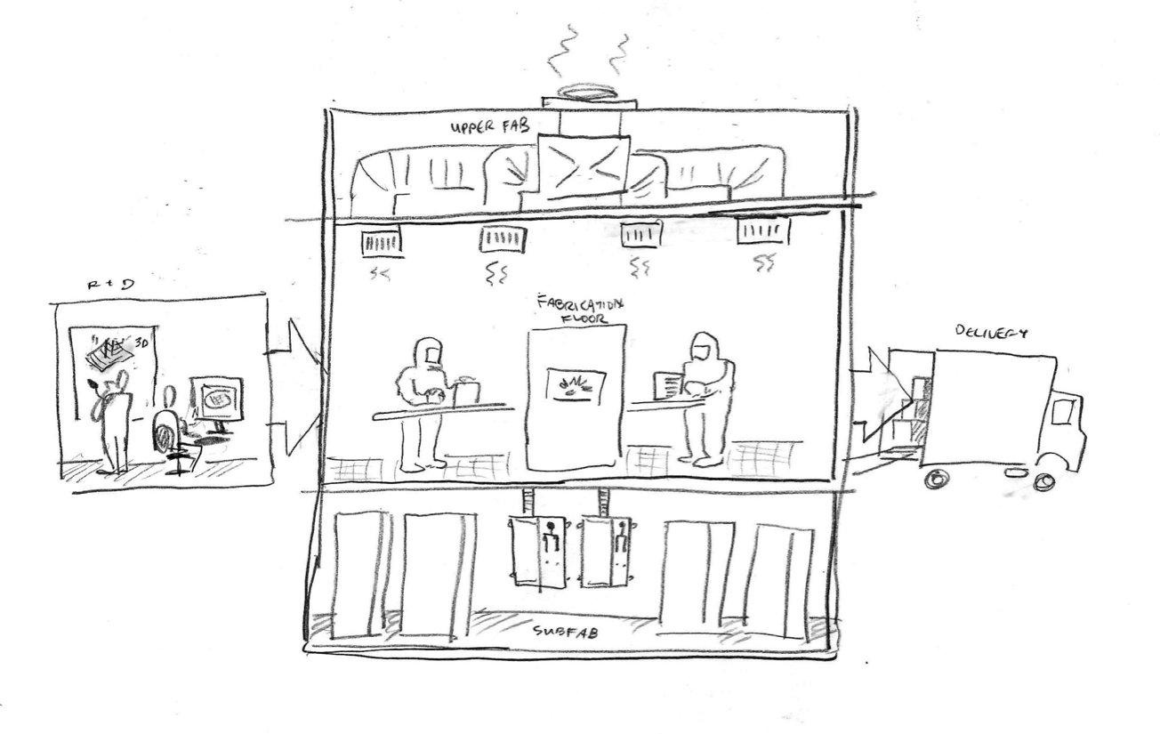
It’s off then to the illustrators’ desks for blueprinting the campus layout (pretty much like an architect’s diagram – in pencil sketches), and planning out the “space” within the infographic. We opted for A1 size to give sufficient room for displaying detail without losing on the portability factor. From pencil sketches, we went digital, composing the infographic using tools like Freehand and Flash. Then came the integration of content layers with the infographic – most critical step in the process and also the most painful as hard decisions are made about how much information to keep and discard. This is when the “story” of the infographic is born and for something as complex as this, it can make all the different between being tossed away to a corner, or given pride of place in the Dean’s display board.
Final steps then included colouring and labelling and finally optimizing it for various digital and print formats.
The Result
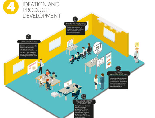
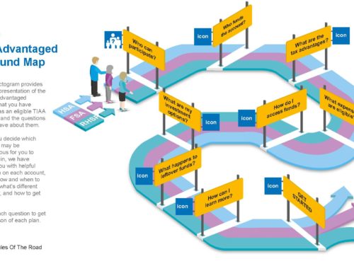
There are different types of infographics. For B2B marketing another very useful format of infographic is depicting a process flow. Sometimes those are very complex – especially the multi-dimensional ones. There are few additional considerations for creating those types of infographics.
Establishing Context, multi-dimensional and interrelations of the dimensions: The problem of multi-dimensional infographics are that they can easily lose the context by information overload and loosely established relationship of different elements. Planning out the space mapping with just pencil and paper helps.
Establishing Causality: in a non-multimedia infographics it’s the toughest part, but the soul of a process or procedure flow infographics is cause-and-effect.
Where to go from here?
Used properly, Infographics can help in a great deal to market complex solutions or products which are difficult to articulate. Not only on print, infographics are also taking shape in several other formats, such as interactive narratives, visual explainers and other digital formats.
by ASUTHOSH on DECEMBER 6, 2010


