10 Key Elements of a Perfect Investor Pitch | Slideshow | Entrepreneur.com.
Visuals Support These 10 Elements
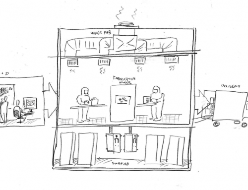
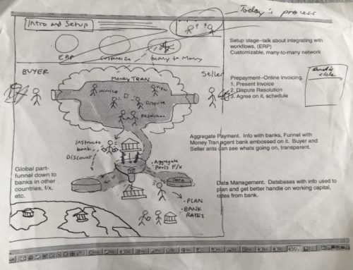
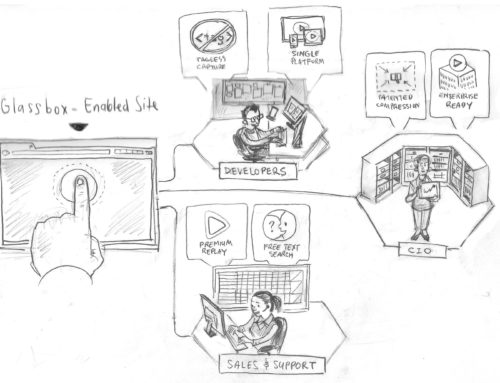
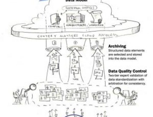
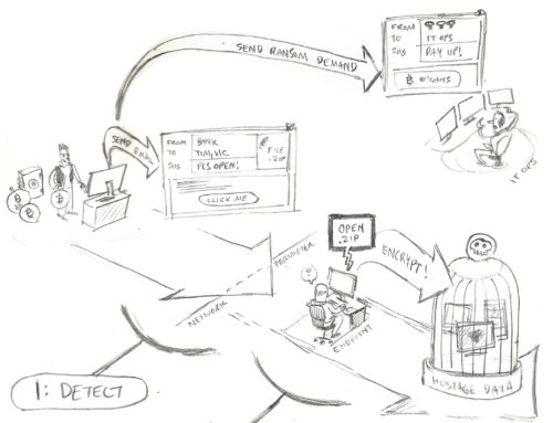
Off of the 10 Key Elements recommended in article at Entrepreneur.com in their article today – I make a case for realizing these 10 Elements with Visual Solutions. See my thoughts below the sample slide pictogram we do for startups.
Samples Startup Pictogram for Slide Presentation
Startups Stakes are High – Visual Solutions Enable Investment Pitches
Here at Frame Concepts, we do a lot of work for startups and in some case the solution is not fully baked and visual communication targeted at the investor is required. In going through this list on this article that came out today, was pleased (i.e. good for Frame business) that most of these key elements are best served with visual solutions. Here are crib notes on how visual solutions enhance the key points:
1. Know Your Audience – we actually at Frame with our solution pictograms call out each audience member type in our client’s ecosystem like the sample above.
2. Do Your Homework- suggestion by article to “practice and practice” – no better way to get the pitch right than be speaking to intuitive visuals and of course – practice and practice …
3. What Problem are You Trying to Solve – In the pictogram sample above we actually put the problem in the “Before” scene on the left side so they could see the solution in the context of that problem.
4. Tell a Story – Visuals and Narratives go hand in hand – need I say more?
5. Demonstrate Your Passion – Well that does fall on the presenter but I would suggest a well-crafted presentation shows your excitement and care you have about your investors getting the point quickly – you value their time don’t you?
6. KISS – (Keep it Simple Stupid) we fit your complex startup explanation on the back of a cereal box – thats not easy to do and it takes time at the ideation pencil sketch phase – but in term of finished product – its hard to get simpler than that
7. Talk up the Team – we have done icon versions of the management team showcasing their distinctive talent they bring to the table or a visual timeline of their background to show how it supports the startup mission
8. Act Naturally – a well crafted and thought out visual slide presentation should let the visuals do their explanatory work and allow the presenter to relax and put their personality against their summary of the slides and point at hand.
9. Back it Up – good to go with a data visualization to show how what-if scenarios would play out to make sure you show them you are prepared.
10. Make it Snappy – we had a new predictive analytics firm explain to analysts how their solution works in one highly impactful infographic on one page. The analytst firms reached out to Frame how we could do the same for their research practice.
Well thats my wrap on how to hit the key elements of an Investor Presentations with well thought out visuals. At the end of the day its the startup founder(s) ideas and execution plans and skill-sets that get the investors onboard but a clear visual deck to get them onboard quickly stacks the odds in your favor assuming the fundamentals are there.
View some case studies on how we supported startups
And to get a live demo and free consultation for your startup (or enterprise with new ideas)


