As Attention Spans Drop, Pretty Pictures Made of Facts Look Like the Future of Communication
Ludwig Wittgenstein once said that “what can be said at all, can be said with clarity.”This may be one of the best reasons why data visualization was created. It was actually developed more than 400 year ago, and today is still mostly associated with its basic form — infographics of the kind we see on the Weather Channel or on CNN during a presidential campaign. Driven by technology, data visualization is now rapidly becoming sophisticated, and is destined to become an important part of your brand.Wittgenstein also claimed that “all that can be shown, cannot be said.” And indeed, we’re blessed with at least five senses, but the most useful of them for data consumption is sight.Not sure? Think about the oldest data visualization tool, the map. Now imagine a pure text file given to you for your first visit to NYC instead of a map. Now try and cross town for lunch.Language is a subjective coding system for ideas, realities and experiences. But, through the last decade, the disadvantages of text-based language have become very evident.
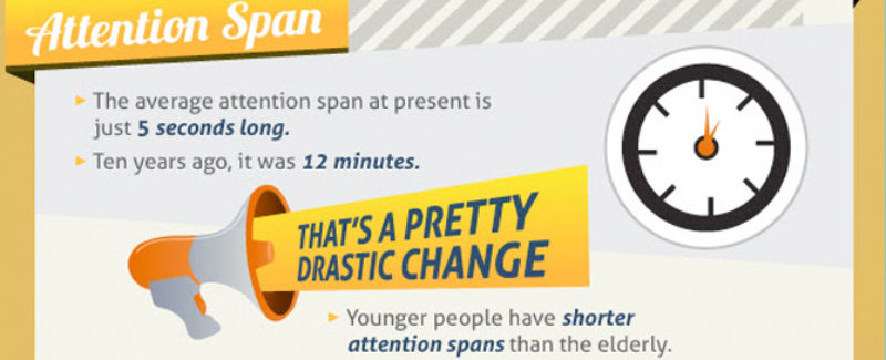
The problem is bandwidth; our text-based input/output through-rate just can’t cope with the amounts of information we deal with today. The results are all around us: shorter texts on all media, SMS, lower common denominators for content quality and, of course, the 140-character epidemic. Add to that the increase in the number of HD screens surrounding us and the exponential growth in processing power, bandwidth, and storage and you get the rise of data visualization as an important factor in modern communications.
A current description of DaViz would be something along the lines of a “simple and understandable visual communications approach that abstracts data over time, and describes the relationship and relativity of the essence, cause, and dynamics within a data set.
Or, if viewed from a process point of view, it is “a bettering journey from data to information and eventually to insight.” Whether expressed by weather prediction, mind and semantic maps, visual simulation of complex biological processes, or just by a beautiful and innovative way of presenting statistical data, DaViz is quickly invading our digital displays.
Where this gets very interesting for marketers is in the context of our ever-growing need to stand out and find new and ownable ways to engage and communicate with consumers.
We can and should think of DaViz as part of the brand’s sense of intuition — that charming and ancient analog quality. Intuition allows us to cut through the clutter and the data overload, observe, perceive and deduct knowledge or understanding that appears to come out of nowhere. In a similar way, data visualization allows us to focus and personalize our engagement platforms and communications with consumers around the essence of the brand’s value and message.
As data visualizations are increasingly more aesthetically pleasing and leveraging new, technology-based ideas and designs, their importance to the brand’s visual identity and language will only grow. We have seen great results achieved in the physical world through design languages that synthesize form, function, sound, smell, color, and texture to define the brand. And today, through the multi-screen lives we live, a brand can tell its story while differentiating itself with data visualization.
As a couple of simple examples, think of Omega watches buying Gapminder instead of Google, of Accenture owning “Harvey balls” as part of their high-performance positioning, or Intel owning tag/word/data clouds when it was introduced earlier last decade. We suggest you consider evolving your next brief to also answer the following questions:
- Can data itself become an asset of my brand and a pillar to visually enhance our story?
- Have we enhanced our product, or broke through communication barriers using DaViz?
- Is there a new product idea for my brand which can stem from data visualization?


