Brainstorming the Community Healthcare Infographic
There were a lot of angles one could take
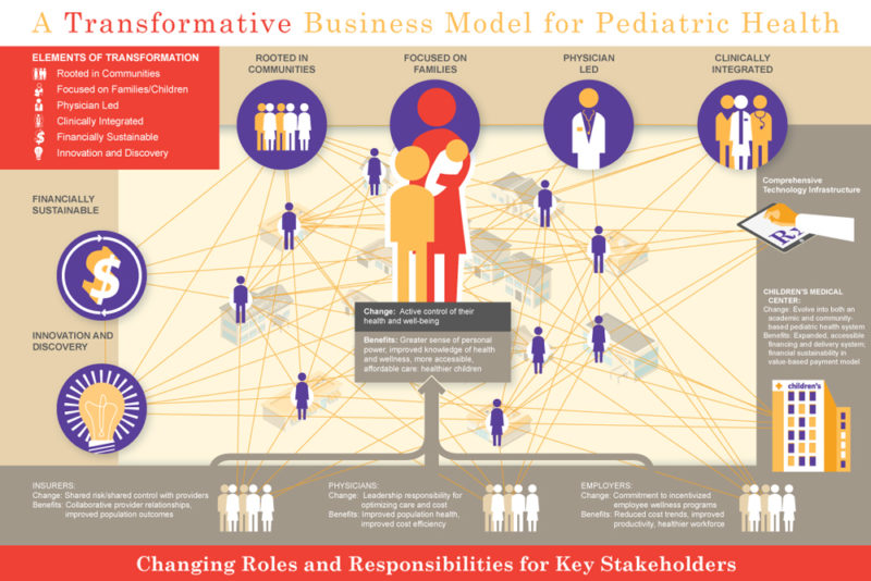
We recently had a repeat client open up a new project. Her internal client at the Hospital was a senior medical practitioner who had been leveraging an unwieldy slide to communicate a provocative stance on transforming the healthcare system in the greater Dallas Texas area.
Our client’s verbal summary providing context and the slide itself helped myself and the information designer assigned to the project come to terms with the nuanced content that was trying to be expressed. I quickly (especially for an early Monday meeting with only half a cup of coffee) jumped on the positioning wagon. I took a shot at the first verbal strawman:
Lets think of this new model as an mechanism – one needs the engine – and the engine is the fact that the hospital system is going to underwrite the medical program so the community can access it and then on the delivery side, traditional community institutions – schools, YMCA’s, churches – would be repurposed for patient care and on the execution side – each of the outreach centers would be equipped with the latest medical telemedicine equipment making world-class healthcare available to everyone.
Fitting the”community” into the healthcare infographic
My client paid complements to my quick understanding but – and there was a “but” – her client’s biggest beef is that we need to put the community into this visual. The community underpins the whole approach. Unusually quick on my feet – I usually come up with idea after the meeting, I suggested that without this new approach the “community” would have no ability to pay for it, no ability to access it and no access to the latest in medical care approaches. This approach is purely integrated to the “community”. I think this played well. But then there is the hard part – actually creating the visual itself.
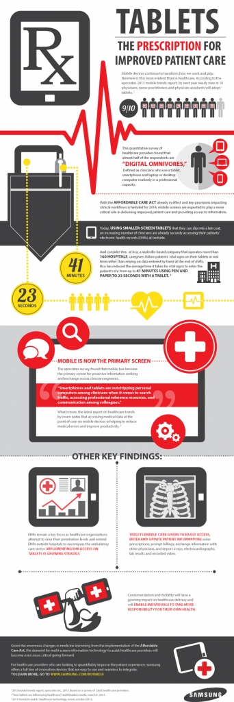
Sample Healthcare 2D Infographic
What about the healthcare infographic sketch?
For those that have been in our Frame Concepts kickoff/brainstorming session – there is a healthy back and forth and I try to put our clients in uncomfortable spots – suggesting that their offering and more importantly their offering is commonplace. There is no distinction (Of course in a diplomatic way). And one benefit is that the information designer – the person responsible for the initial concept sketch – is they get to see the back and forth – the client correcting me, suggesting I have underemphasized an important point or missed something altogether. They really like the analogy I surface or they hate or they are indifferent. And they hear the tone in the client’s voice as they try to make a nuanced point. And because we typically do these sessions on a webex session they can start to sketch as the debate rages on.
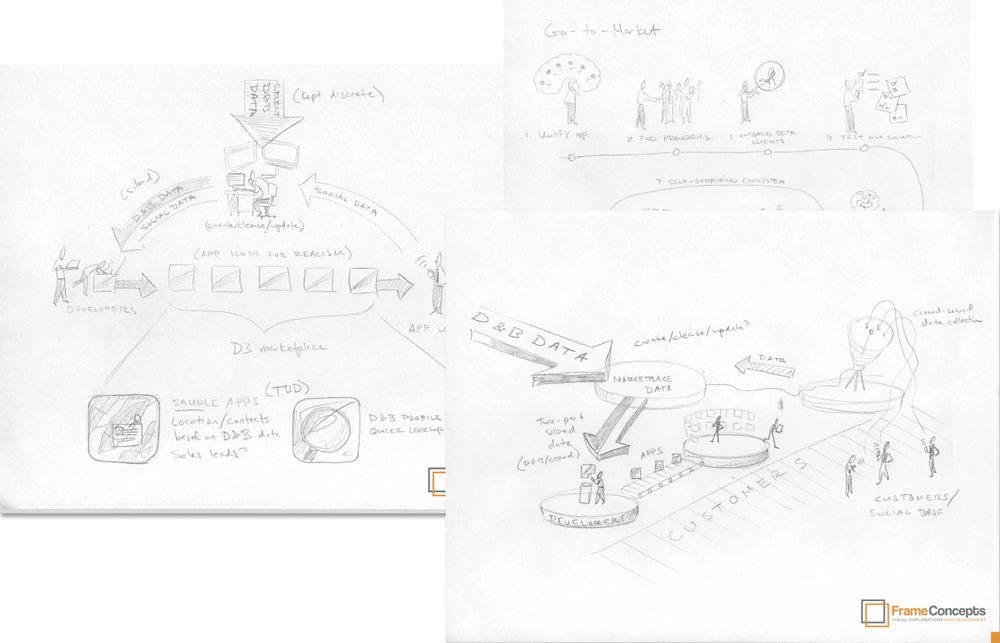
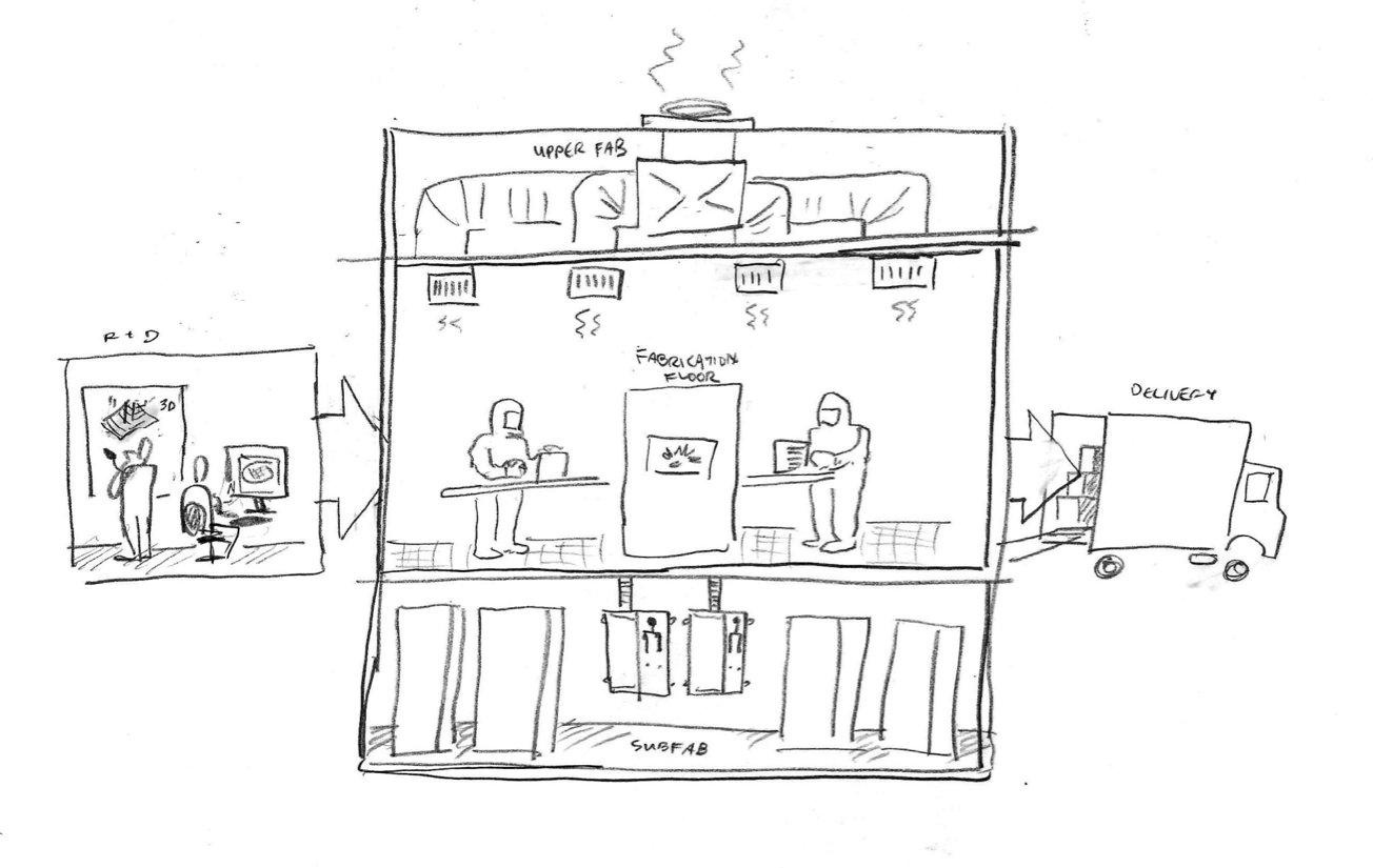
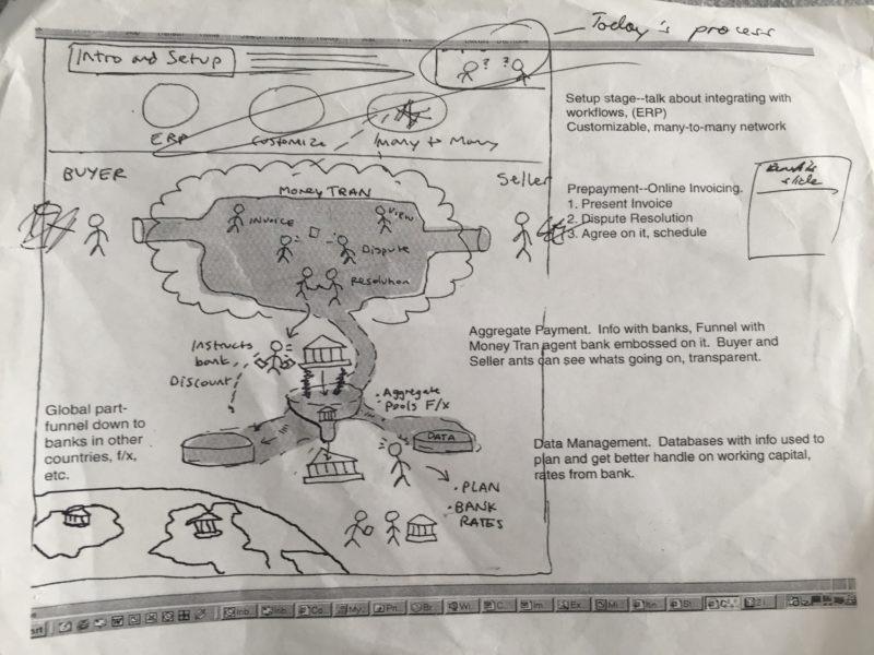
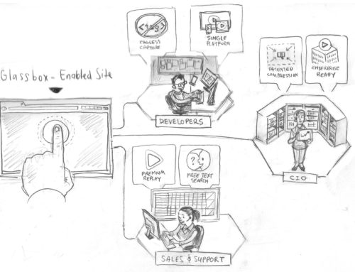
Sample Ideation Sketches
Back to the Healthcare Infographic
So what about resolution to the positioning on this project – well maybe not a nice thing for me to do for a blog post – but we only had the kickoff this week so no resolution – YET! But it struck me that their are important weighty matters where the marketplace is struggling to communicate abstract and conceptual points. And here at Frame Concepts we see the white flag come up on a daily basis. And its extremely gratifying that there is real gutteral need that company’s business is dependent on or an agencies mission is wrapped around – and we conquer the problem with a visual that fits on the back of a cereal box. Visuals help business – period.
Your Communication Problem
You yourself probably have unique business challenges that you wrestle with. You need to find ways to express your solutions, your offerings and your brand to an audience that is overwhelmed with data. Think about visual solutions and the types of content that could be created to break through the noise? Yes, it could be a tough nut to crack, but that’s what Frame Concepts is here for.
We’d love to hear all about your communication challenges and find ways to solve them!


