

There are many types of infographics on the web, all of which share a common goal: to portray interesting information in a compact and visually intriguing way. This can be done with the use of various charts, lists, graphs, symbols, numbers, and blurbs as well as a whole slew of other ways. When these facets are all combined, infographics can serve as a powerful addition to your content marketing mix by raising brand awareness and driving your target audience to your online destinations.
The art of creating an infographic takes consideration, from theme to target audience and desired outcome. Before spinning your wheels on color and theme, do your due diligence and research the types of infographics that are gaining traction in your space.
Here are 6 of the most frequently used infographic styles:
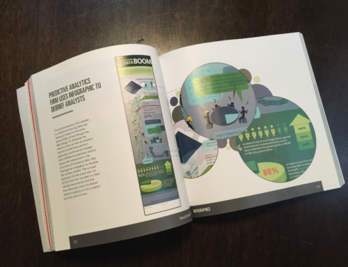
1. Statistical – The goal of a statistical infographic is to take a large amount of numerical data and share it visually. This makes complex information – statistics, numbers, and percentages – easier to process and understand. It is also a good approach when trying to share focused information with a larger demographic. Numerous charts, bar graphs, and numerical data are used in these designs.

2. Timeline – Timeline infographics are pretty self explanatory: their goal is to show the progression of something over time. This could be the development of a product or idea or just a showcase of events that have happened.

3. Process – Have you ever noticed that on the back of many food boxes, the instructions that show how to prepare that item tend to include images? Process based infographics are meant to make learning how to do something simpler through the inclusion of examples, lists, and images. Process infographics are very useful when trying to teach skill sets, from the proper steps to a successful tweet to how to successfully juggle social media channels.

4. Comparison – Comparison infographics focus on the merits and faults of two separate things. This can be done through the use of a Venn diagram, chart or other simple division. For a marketer, a comparison infographic is best used to showcase the benefits of your own product or service. Subtlety and facts are optimal when used with comparisons so that the infographic is not merely an advertisement.

5. Geographic – A geographic infographic is one that shares information based on location. They are usually outlines of states, countries, or continents with information relating to those specific places. These can be used to give information about the origins of various practices or products or show the placement of different people with certain interests. A marketer could use this to show the geographic spread of various customers across the world or show international capabilities to prospects.

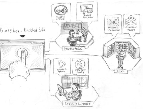
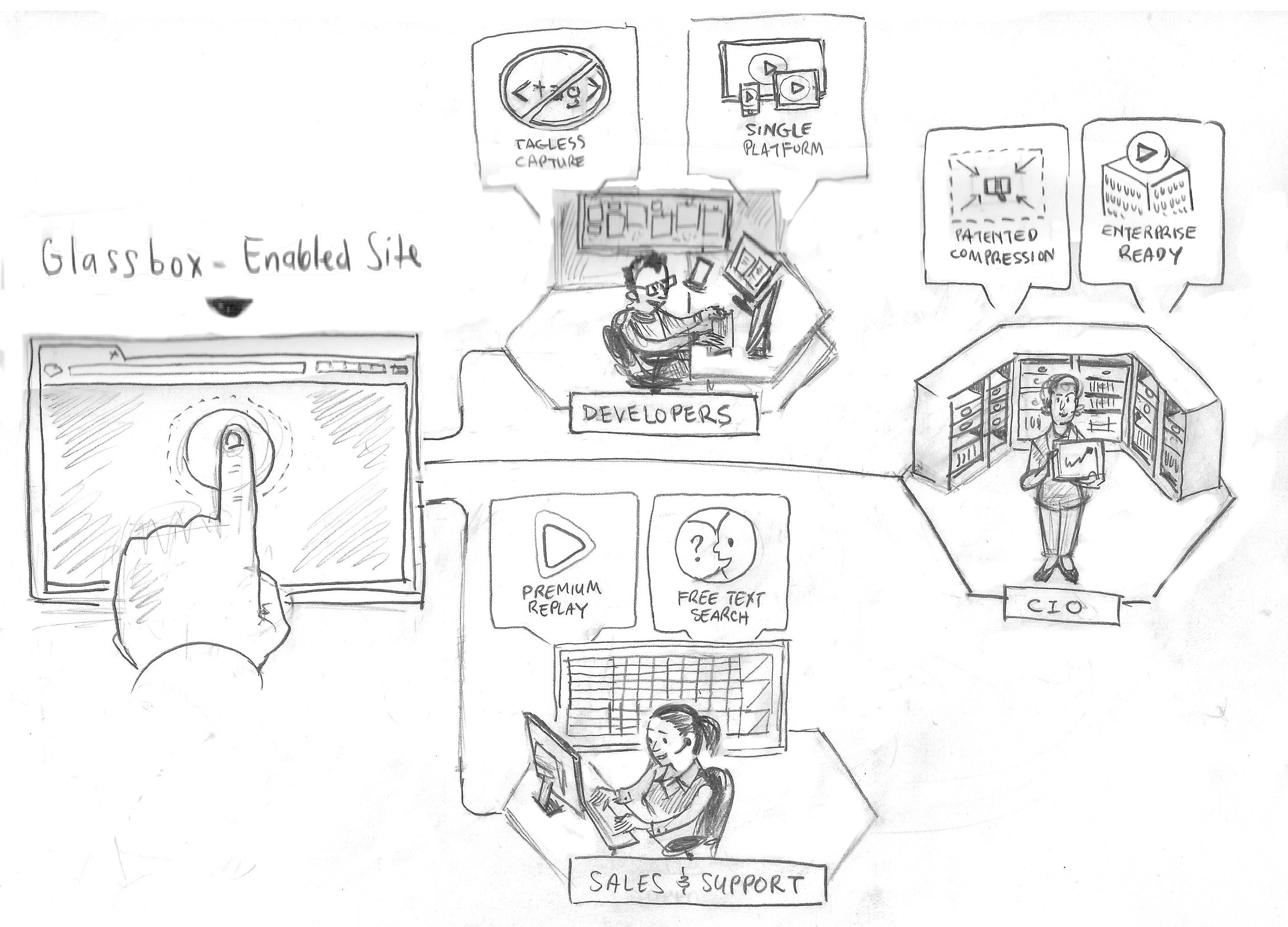
6. Informative – A generally informative infographic may take cues from any of these other types and focus them all on one topic. A marketer could focus on “lead management” and create an infographic that includes statistics, timelines, geographic data and more to create a specific and informative graphic that develops a guide for the proper management of leads.

Are you using infographics as part of your marketing mix? Visit our resources page to discover more content marketing ideas.
By Maria Pergolino, Published September 14, 2011

