

Dizzying Range of Need to Be Visualized
Last week was a unusually busy week for me (thus I am writing this blog on the weekend). A wide range of new and existing demand to bring offerings into a point of understanding through visualization. But there was one that put a smile on my face.

It Wasn’t so Much The Content
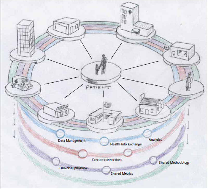
There were other topics that were arguably more interesting. We were working on an eBook with an infographic spread on how to become a licensed captain. We were also discussing a long term strategy with a Fortune 500 Energy Technology company, how to build out a solution that will allow them to view spare parts status on a global scale for multi-site locations. And we in early stages of building out a Board Retreat interactive pictogram on the topic of Population Health. And were having internal Frame meeting thinking about developing a data driven visualization platform. Pretty heady and cool things.
But it wasn’t so much the content but the form the content that my client brought it stirred up thoughts from memory lane.
I Couldn’t Quite Make out the Writing
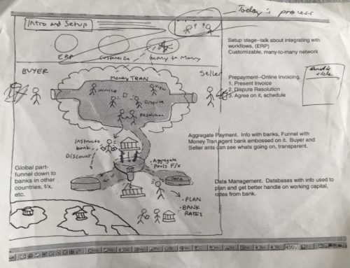
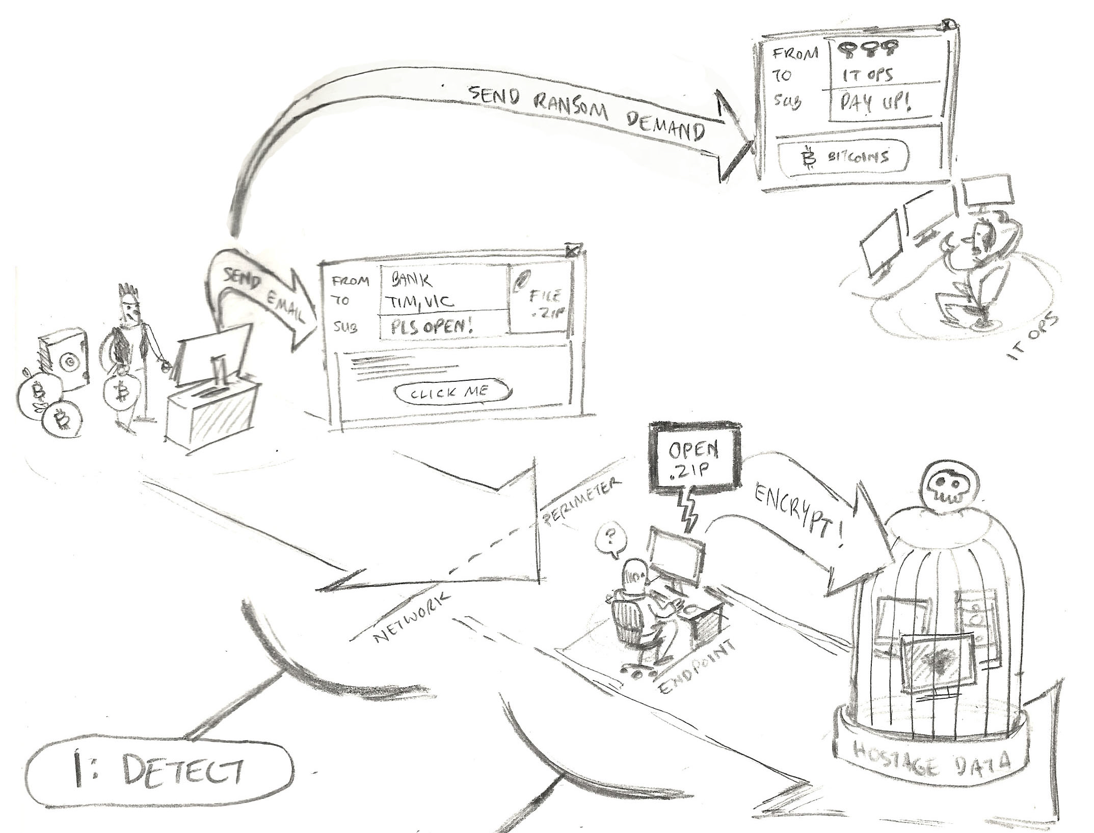
The client – a new relationship – was a startup in the compliance space within financial services and they had (or rather have) a very clever platform to make the burden of compliance obligations for both the financial institution and the counter-party more efficient and less of an administrative burden. The format of the reference materials before the debriefing came in two distinct forms. There was the typical presentation deck rife with neon powerpoint neon graphical squares layered beside each other or connected to each other with a spaghetti of directional arrows. But the crowning piece of glory was two photos taken with a smartphone from two whiteboard sessions.
When I zoomed into each part of these elaborate architecture and process diagrams I could make out the labels.

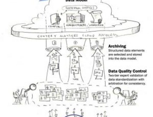
Thumbnail Sketch of Whiteboard (purposely non-readable)
Some Ideation Going on Here
Like some kind of visual archeologist, I was immediately impressed that I walked into a site with some very fervent debate going on exactly what was the point of the solution and who got what value from it. And of course my client was able to provide me the context by walking through both the slides and the whiteboard complex drawings (and some of the labels that were not clear).But the fact that this engagement stood out to me more that the others that week was not so much about the content – it was about me.
Its All About Me
I live downtown Manhattan and most of the smells that you pick up you don’t really .. well … you don’t want to pick up. But occasionally early in the morning after a fresh rain and a nice cross-wind you get one of those odd smells for what others experience on a daily basis called fresh air. And in that brief and infrequent moment when I get that fresh morning air smell walking down the crowded streets of New York, I am immediately taken back to my small town where I grew up. And I have to say that the photo of the compliance solution whiteboard session and clunky powerpoint slides brought me back to my client side professional marketing experience (which is most of my 2o years experience) where I too was forced to come to terms with my employer’s offering over a whiteboard and a series of evolving powerpoint slides.
A feeling almost core to my entire marketing communication career.

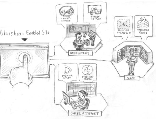
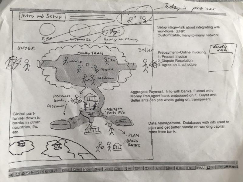
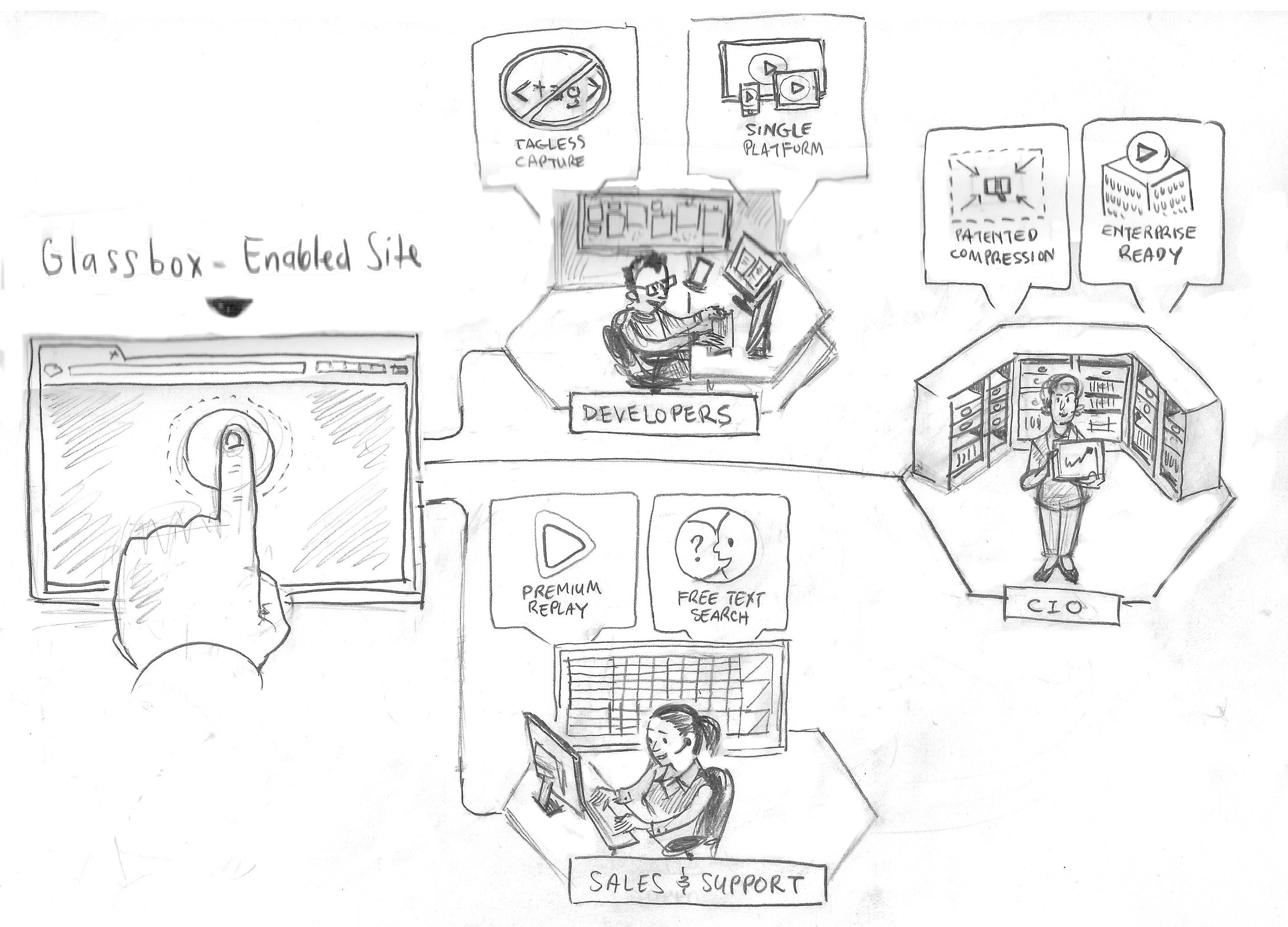
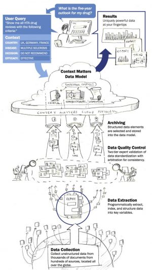
Sample of Power of Information Design in Final Form
It Feels Good
But of course the context for this situation (the messy whiteboard and clunky slides, not the fresh air smell) is different in a very, very, very good way. Thats because the clunky neon charts on powerpoint slides off of whiteboard sessions and perhaps a dab of graphic design from the resident graphic designer WAS the end product. That’s all I had. Now with information design adapted to business communication (which if you did not know is core to what we do at Frame Concepts), my previous end product is the starting point for the project. Instead of representing a white flag, its the formative part of a soon to be realized killer data visualization.
Back to the Trenches
Well all of these projects I alluded to including the compliance whiteboard photo project are in the air and in their formative stages. But perhaps because I am writing on the weekend, feeling a bit nostalgic and a bit elated at the same time that clunky attempts to visually come to terms with an offering are now just formative stages in exciting new visual solution. Perhaps I should stop blogging on the weekend. Perhaps not.
If you would like to learn more about our visual solutions for your company, feel free to click here to receive a free demo and consultation.