 I’ve always been a sucker for a stunning graphic. There’s something about the beauty of data rendered aesthetically and the ease in understanding complexity through visual design that lured me into a career of visual communication.
A recent article on the Pamorama blog highlighted the use of Infographics to convey and communicate complex data in a more accessible way (see 35 Great Social Media Infographics). This reminded me of how often we’ve seen reports, presentations and PowerPpoint decks loaded with basic charts and tables, bulleted lists and a multitude of data designed to give the reader the impression that a lot has been happening — but not really giving them anything they can grasp and understand.
Infographics, or more simply, the visualization of complex data, creates a common ground of understanding and communication.
In working with clients, we want to be able to remove the inherent complexity of metrics and statistical analysis and boil that it down into the salient points, the key aspects, in an aesthetically pleasing and accessible way.
Accessibility is an important point. We can bring context and meaning to the seemingly random data through careful choices in visual and graphical representation. Infographics need not be just visually stunning but should precisely communicate the dataset and idea in a contextual, accessible way.
No longer will merely loading up the PowerPoint slides with charts, graphs and tables be an effective way to communicate ideas
the business world today relies upon efficiencies of communication and the ability to identify and extract the key messages from within the chatter. To effectively communicate your message to the viewer, you will need to go beyond the pie chart, bar graph and data table.
A fun and useful example of turning raw data into visual communication is the tag cloud or word cloud, popularized by its use in many blogs to create a graphical form of user navigation. By changing the color, size and orientation of the words within the group, a tag cloud conveys the importance and rank of each word without resorting to tables and rankings.
The tag cloud is instantly recognizable and the viewer’s understanding of it is organic and natural. Wordle is one of the more popular online word cloud generators. It takes text that you provide and dynamically generates aesthetically pleasing and contextually relatable graphics that depict the popularity of words and phrases in your submission.
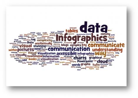
A Tag cloud of this article via Wordle.
For an ongoing discussion on the best infographics, I recommend the blogs listed at 20 Essential Infographics & Data Visualization Blogs via InspiredMag. For those with even a passing interest in the creation of infographics, I recommend picking up the trilogy of books from Edward R. Tufte: The Visual Display of Quantitative Information, which focuses on charts and graphs that display numerical information; Envisioning Information which deals with maps and cartography; and Visual Explanations, which delves into the graphical representation of dynamic data that changes over time. Tufte is a vanguard in data visualization and he has described his books as being about, respectively, “pictures of numbers, pictures of nouns, and pictures of verbs.”
Post by Russ Gallant


