

Aligning Marketing Program Types with Visual Content Types
The effort to support a lead generation through an integrated marketing program as opposed to a product marketing program is quite different when coming up with relevant visual content.
On the surface it appears on the output end that both are simply “infographics”. And certainly there will be digitally rendered illustrations in both cases.
2D vs 3D
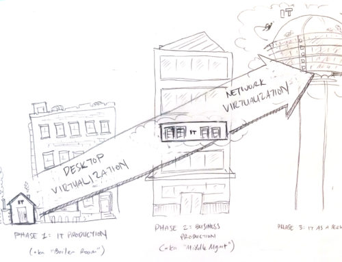
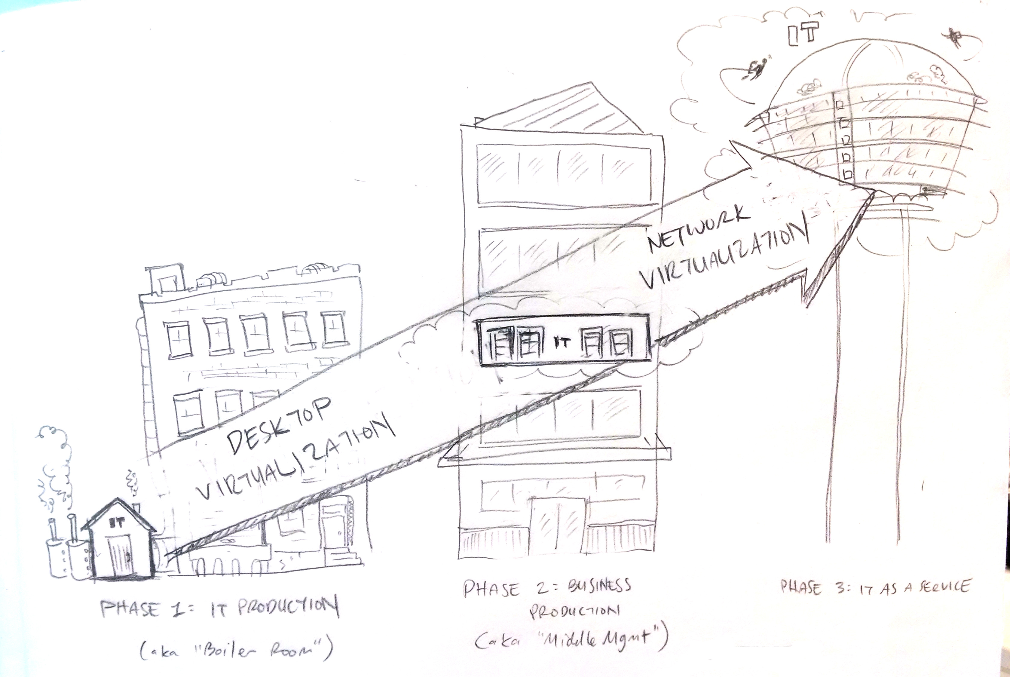
Well the easiest distinction is the pictogram is typically rendered in an isometric style to pull the viewer into the use case depicted. And the infographic is typically flat 2D using iconography and different scale numbers and stick people arrangements to emphasize a certain point or narrative. And we do have information designers that can render 2D but not the isometric style. But this is less than half the story in distinguishing the amount and type of effort involved.
Unpacking the Layers
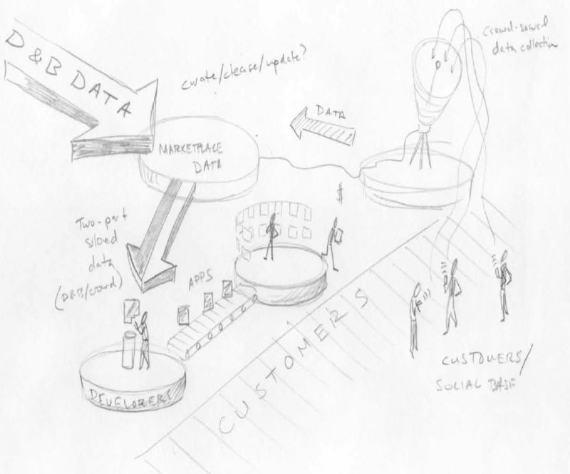
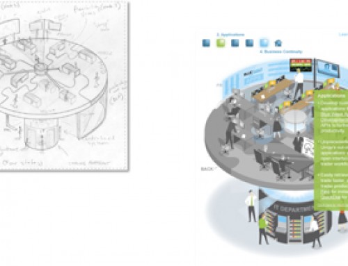
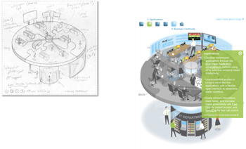
No its the upfront work before render happens that is the tougher effort. Typically with a pictogram your are unpacking several elements of a complex offering and showing the distinctive value. And this involves reviewing disparate reference materials, debriefings and the all-important ideation sketching iterations to get it just right. While the infographic unpacks a tight editorial one pager with lists or survey results or best practice suggestions and turn this into a scrolling tall visual narrative engaging the reader down to the bottom call-to-action – the pictogram is all about simplification. Ideally how can one distill all the complexity of the offering or approach to one single intuitive and engaging visual that will fit on the back of a cereal box. There is a lot of effort to distilling to single page visual.
Protecting the Baby
And because the pictogram is the closest thing the client will have to visualizing the value of their company offering(s) – there is a vested interest in getting it right. And not everyone agrees what that actually is. So the pencil sketch iteration process for the pictogram ends up being a galvanizing force that brings everyone onto the same vision. The infographic as cool as it might be only has a shelf life as long as the data it visualizes is still relevant and is typically superseded by the next visual content piece for the next month. The pictogram – unless the company’s positioning radically changes – could have a shelf life of a few years. And thats why its so important to spend the time up front getting it right.
Moral of the Story
Well why this lesson on the distinction in the first place? Well perhaps if one is not familiar with the pictogram it will be helpful to know that their is a visual solution that speaks directly to the nuances of a complex offering with a complex audience rather than trying to jam a stock photo or powerpoint graphic to the cause.
Your visual content project – if you would like to learn more and receive a free demo and consultation please reach out here – Contact Us.


