

Visual Samples Suggestive of the Right Way to Approach B2B Content
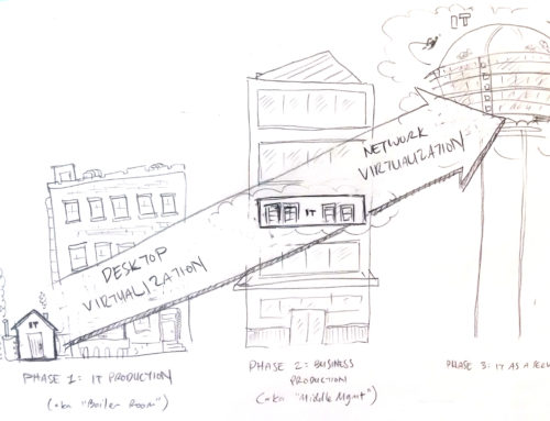
I typically offer up a custom pencil sketch for my first connection with someone I have not worked with before – and I try to offer a sketch that is suggestive that conceptually shows the custom content can go in a lot of different directions. So I use something like the one above:
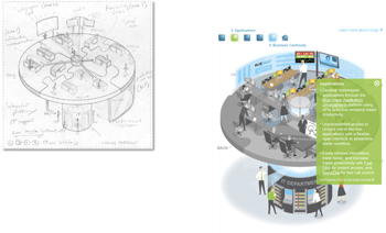
Or something like this:
Five Ways Not to Approach B2B Content
But of course that presumes that my audience is not approaching it in the correct way – and after founding Frame Concepts ten years ago and hundreds (thousands?) of conversations later with colleagues on the client side of the fence the answer is a resounding, “Yes”. And the way it goes wrong clusters into five basic groups as follows:
1. Lots and lots of text – we have so many thoughts about the value of the solution at hand, may as well as throw it on the web page, the presentation, the paper etc. and see what grabs the audience. The result is nothing grabs them because no-one reads it.
2. Stock Images – lets “fancy” it up and make the web page or powerpoint or paper look “professional” and insert stock photos of good looking office workers so its not all text. The result is again nothing grabs them because their is no explanatory tie-in between the solution content and the images.
3. Product Screenshots – well the screenshots of the user interface are certainly suggestive of part of the solution and they can see some of the functionality with the button labels. But the problem here is that you are trying to convince a business buyer the value of the solution – and that value is not lurking on a screenshot of the user interface – the conceptual point and value of the solution is … well a concept … and you need to do the hard work to visualize that concept. No – Do not do a stock photo image search for that concept. See above point 2.
4. Use clip art and graphic design – PowerPoint comes with graphic design features – clip art, transitions, shapes, drop-shadow or you could hire a graphic designer to lay out the text and clip art with a professional look and feel. The problem is that you are not dealing with the problem at hand – visually trying to explain the point and value of the solution offering. Clip art and graphic design in general brings it into brand and perhaps makes it look professional but does zero to actually advance the understanding the solution.
5. Leverage Icons – this seems to be a fad now and a lot of WordPress website themes come loaded with stock iconography. So in this case, the design breathes a bit more – some white space and some stock icons instead of titles and solution names. But again the end result is to make the content look like it has gone through the process of concept sketching and information design. when in reality is just aping a bit of the look and feel of information design with some stock icons. No substitute for a blank page and concept sketching off of a kickoff ideation session with subject matter experts in the hands of a capable illustrator and information designer (not graphic design)
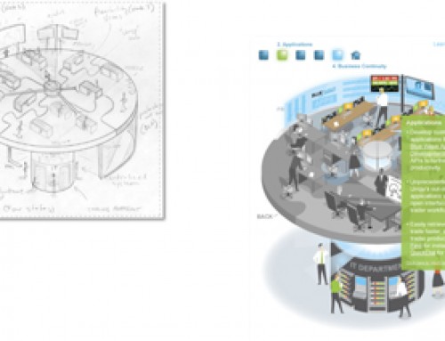
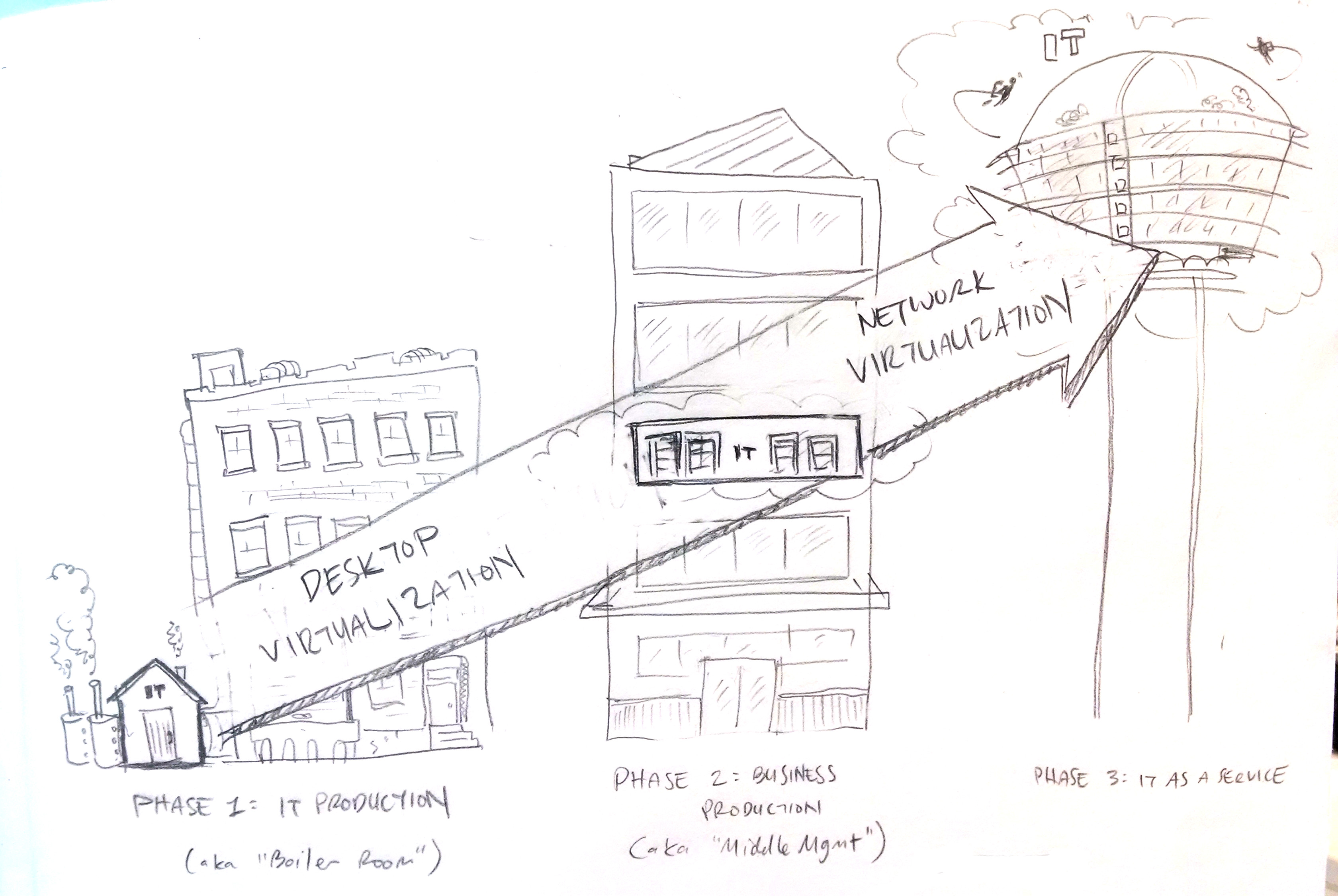
A Rendered Pencil Sketch Style Visual Solution Explanation
In Conclusion
The irony here is that the majority of time in that typical first encounter I spend with someone who I have not worked with usually yields a response indicating they have a visual content solution in some form in place. But when I look at their website and their B2B content kit – I see all of it (not some of it) has applied one or more of these Five Ways Not to Approach B2B Content. And then by ideating and showing them live samples of custom content we create in their space and loads of loads of diplomacy – the hope is they “get it”. A casual glance at most of the content on even the Fortune 500 B2B tech and consulting space – our sweet spot – suggests that most still do not “get it.”


