Ideation Sketches
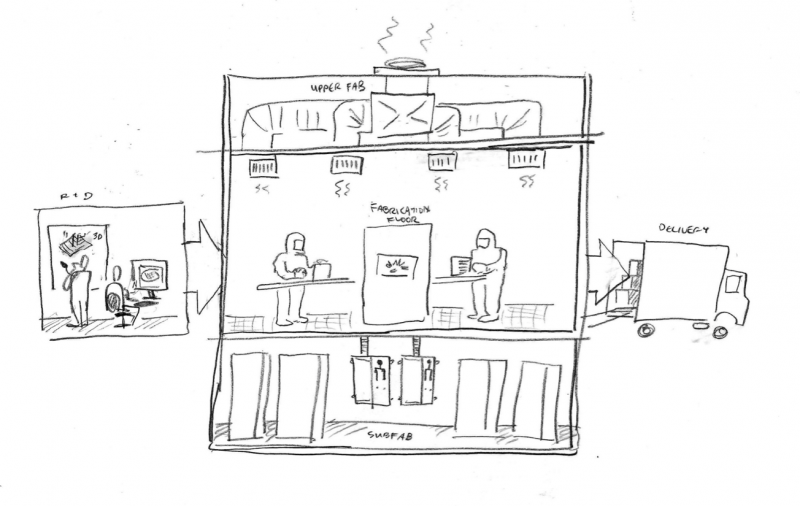
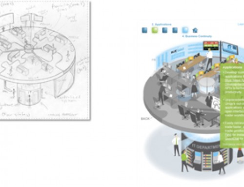
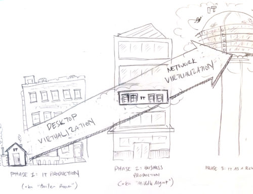
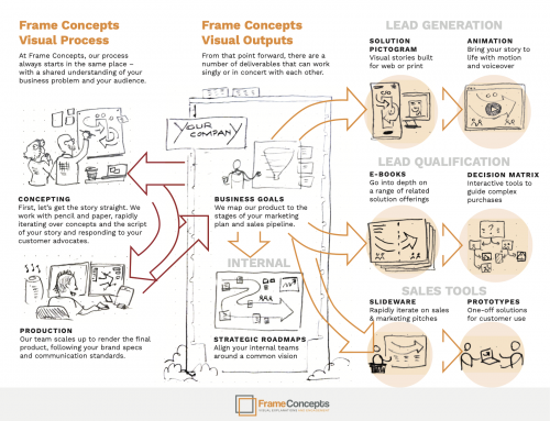
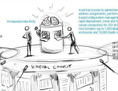
We create all of our custom visual content from scratch. We start with a blank page and then pencil sketch after reference material review and client debriefing. The good thing about pencil ideation sketches is that they are easy to modify. And our clients now with a visual in front of them based on their content and debriefing are encouraged to offer guidance precisely because they can see that the sketches are modifiable.
Seeing the End Game
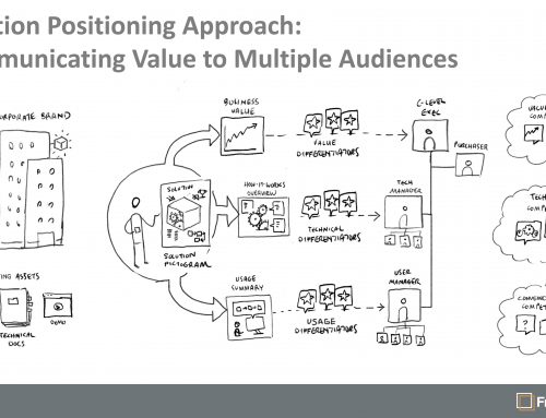
But sometimes it’s hard for our clients to image what the final output is actually going to be so we came up with a delivery format where we lay the sketch out with title, body text, labels and text boxes. So now we applying the craft of information design to the text content and visually ideating with the pencil sketch
It Works
Not only can the client better see the sketch in the context of the whole piece, it also encourages them to think (or re-think) what content is most important now they can see the visual is doing a lot of the heavy lifting in explaining the key concept(s).
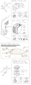
Sketch Layout with Text
Smooth Sailing at Render Stage
So with both sketch and text guidance, we revise the draft with darker lined sketch and final approved text so when our rendering team does the final artwork with corporate brand guidelines there are no surprises and no unnecessary re-do’s of artwork.
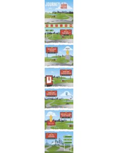
Example of Rendered Artwork
Double-Edged Sword
This formatted sketch layout process emphasizes are distinctive skill-sets – ideation sketching/illustration and information design. This is not graphic design just to make content look on brand and professional – but it does that too. The important end result is our client’s clients understand and engage with the content. And that cannot be done solely with graphic design and branded stock images.


