

They Both Have the Word ‘Design” in Them
It can be very difficult to explain the conceptual distinction between Graphic Design and Information Design especially to a Procurement Department during the on-boarding process. Typical comments from the Procurement Department are:
- “We already have a graphics department”
- “Ad or Branding Agency so-and-so are the Agency of Record”
- “We have a Brand department and expect all materials to comply so we are looked after”
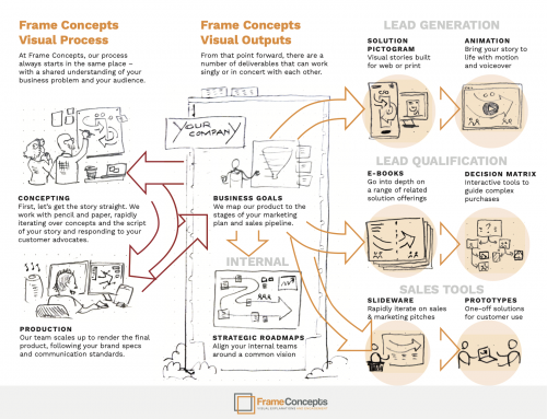
My typical question I ask is simply does that team have the ability to take dense reference materials and ideate with technical subject matter experts and sketch and illustrate (not graphic design) the key narrative concepts and edit out the relevant layers of dense content to integrate with the large explanatory illustrations so the whole visual piece explains and engages as a stand alone piece. Oh yes, and fit it all on the size of the back of a cereal box.
For most of the large organizations that we support and for those that I was employed – the honest answer was and is “no”.
Can You Make My Document Look more “Professional”?
The issue gets a bit more murky when our business clients simply have too low of standards in what the visual content is suppose to achieve. Having been limited to graphic design layout working with text, stock photos and clip art – the business owner of the content can simply ask to make it look “professional” or if they are more corporate marketing friendly – make it “on brand”. But the content should and can carry more communicative weight than that. Armed with intuitive visuals, the content should strike that “ah-hah” moment where they get the point very quickly and now they are engaged. That should be the standard – does this visual piece make the audience “get it” and are “they engaged”. And yes … ahem … it should of course look professional and on-brand. But that goes without saying, right?
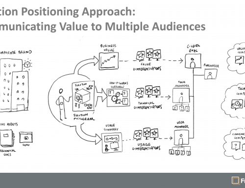
A Typical Sample of Graphic Design We Do
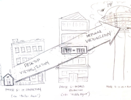
Information Design Day-to-Day
While I know this distinction only too well after going on my own and offering pencil-sketch driven visuals armed with the craft of Information Design for the last nine years and doing the graphic design version for twenty years on the client side, a current project reminded me of the distinction. We are on the kickoff call and it became clear that our client field solution marketing team and the team of subject matter experts were not aligned on what the content actually is. So instead of going to visual for our next step, our information designer opted to chunk out what he thought was the key information in a Word doc and then integrate pencil sketches to visually tell the story. It was a very effective tool as all the client team members made their collective changes and now we were on the same page. But I smiled to myself on the review call while we were all staring at sketches weaved into a document parsed out with labels and body text and I asked myself if this in any way could be the byproduct of graphic design. The answer was a simple “No” – It WAS Information Design.
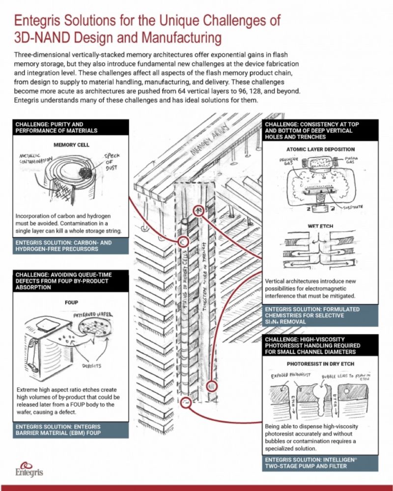
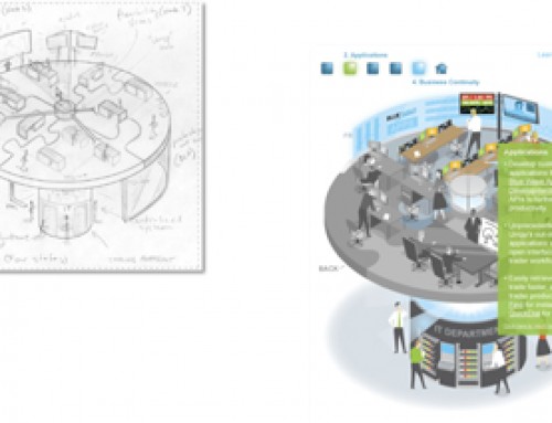
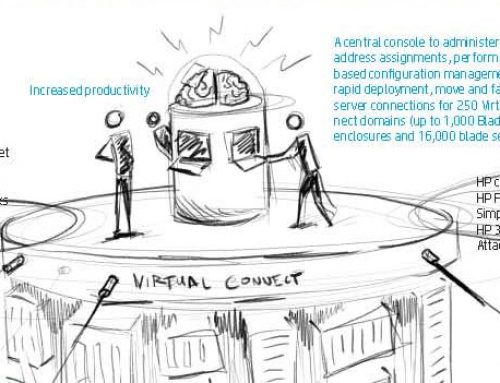
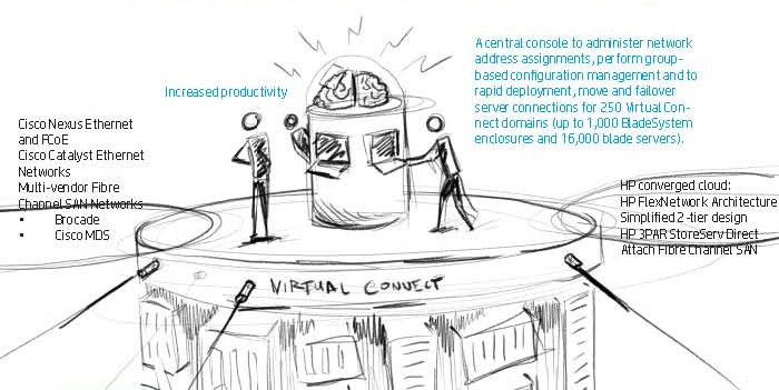
A Typical Example of a Final Rendered Illustration