

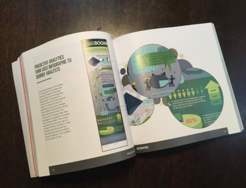
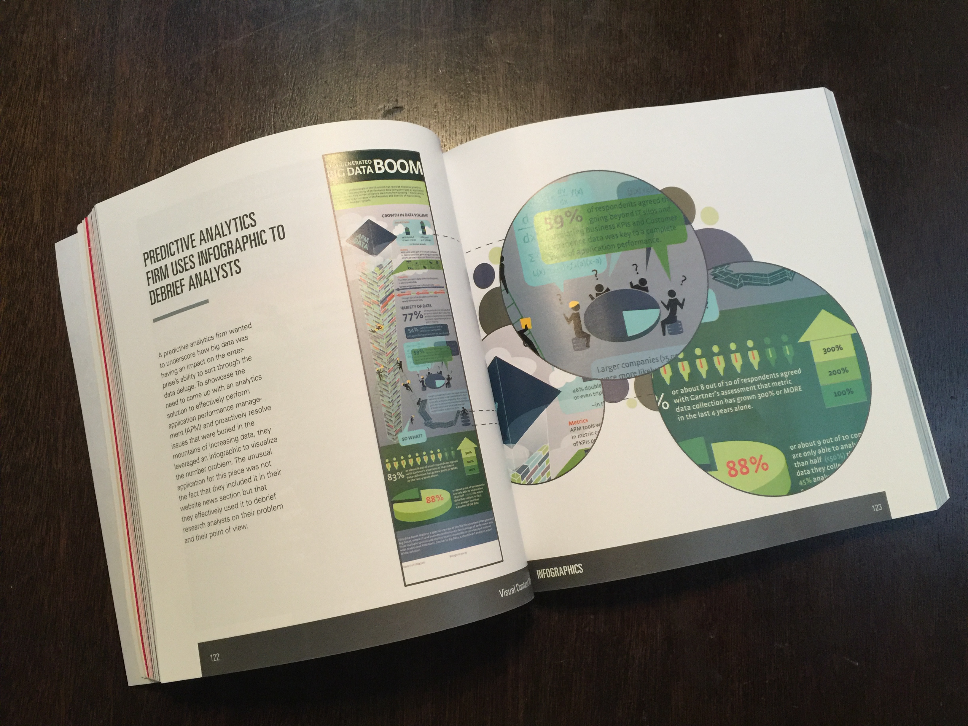
When asked, “What makes a great infographic?” , I answered:
- A quality infographic deepens a viewer’s understanding of a complex topic by clearly and concisely presenting data in an appealing visual design. At the heart of its success is the communication of a story, a point of view, or a fresh perspective.
Other members of the marketing community for their definition of a great infographic, a sampling:
- A great infographic tells a meaningful story that can be consumed in an instantly digestible seating.
– Jeremiah Owyang - A good infographic offers clarity: Simple, clean design. But also, it allows a reader to scan and quickly grok the data being communicated, almost immediately.
– Ann Handley - A good infographic is fun to look at, relevant and rich with an arrangement of information that has context based on the viewer’s interests.
– Ardath Albee
With these definitions in mind, take a look at the latest infographic from Eloqua and JESS3, The Content Grid v2. It’s simply brilliant. I’ll call it the single best piece of content I’ve seen to explain the process of content marketing. It plots content type across two dimensions – the objectives of the business as well as the goals of the customer, making it incredibly simple to see how and where different content types fit into the process.
If you or a colleague have struggled grasping the concept of content marketing, I urge you to use this infographic to help bring clarity to a complex topic.
By Jeremy Victor


