

A Memory of a Brand Positioning Document
I worked at a startup (names hidden to protect the innocent) where we spent a silly amount of money for a new name and a 20 page document that suggested we were a smart sophisticated New York-based technology company.
Well I cannot remember the exact words but it was something like that. The remainder of the document suggested logo (they also created the logo) placement with some mockups of presentation, a business card and perhaps a coffee mug with the logo correctly situated. While we were a VC based startup in the later 90’s when it was a good thing to be a dot-com. Shortly after this exercise the dot com bubble burst and we were forced into layoffs and a disaster sale.
")
And Then Came a Sketch
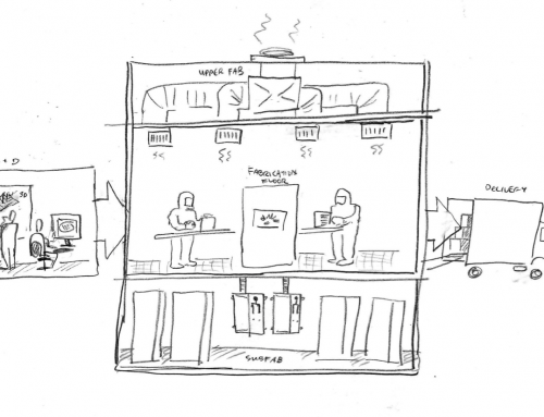
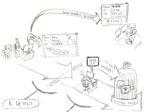
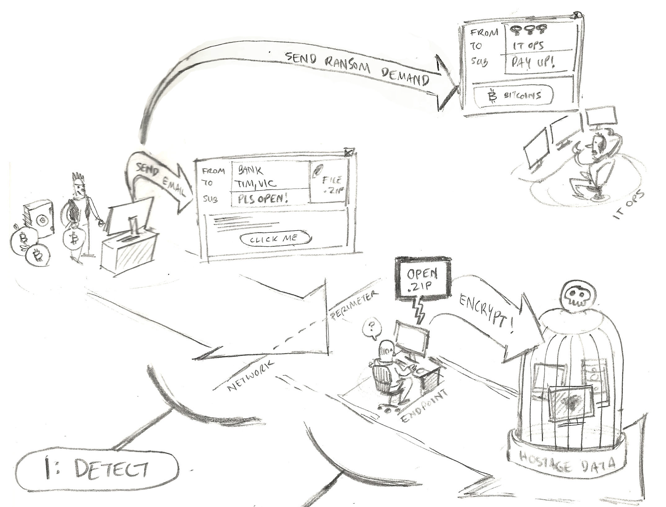
However … around the same time, maybe during the interviews to feed the positioning document – I came across a napkin that had a sketch on it that clearly showed how the tech solution worked (the solution was not ready for production and we only had a demo). While only a pencil sketch – it drove home very simply how it worked and logically displayed the unusual value it offered in this case to both sides of a B2B ecommerce play. In fact the business development crew, while anxiously trying to set up beta clients, were challenged to express the concept even with a web-based prototype. But the sketch – or rather scans of it placed in a presentation deck – enabled them to get their audience onboard with the visions.
The Eyes Started To Roll
Yes when the name was revealed and the company attributes read aloud (yeah the smart sophisticated stuff … ) in a small town hall, there were rolling eyes especially for those who knew the price tag. Everyone was desperate for more meat on their plate that they could tangibly take to market.
Teleporting to 2014
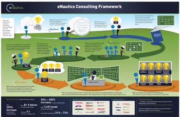
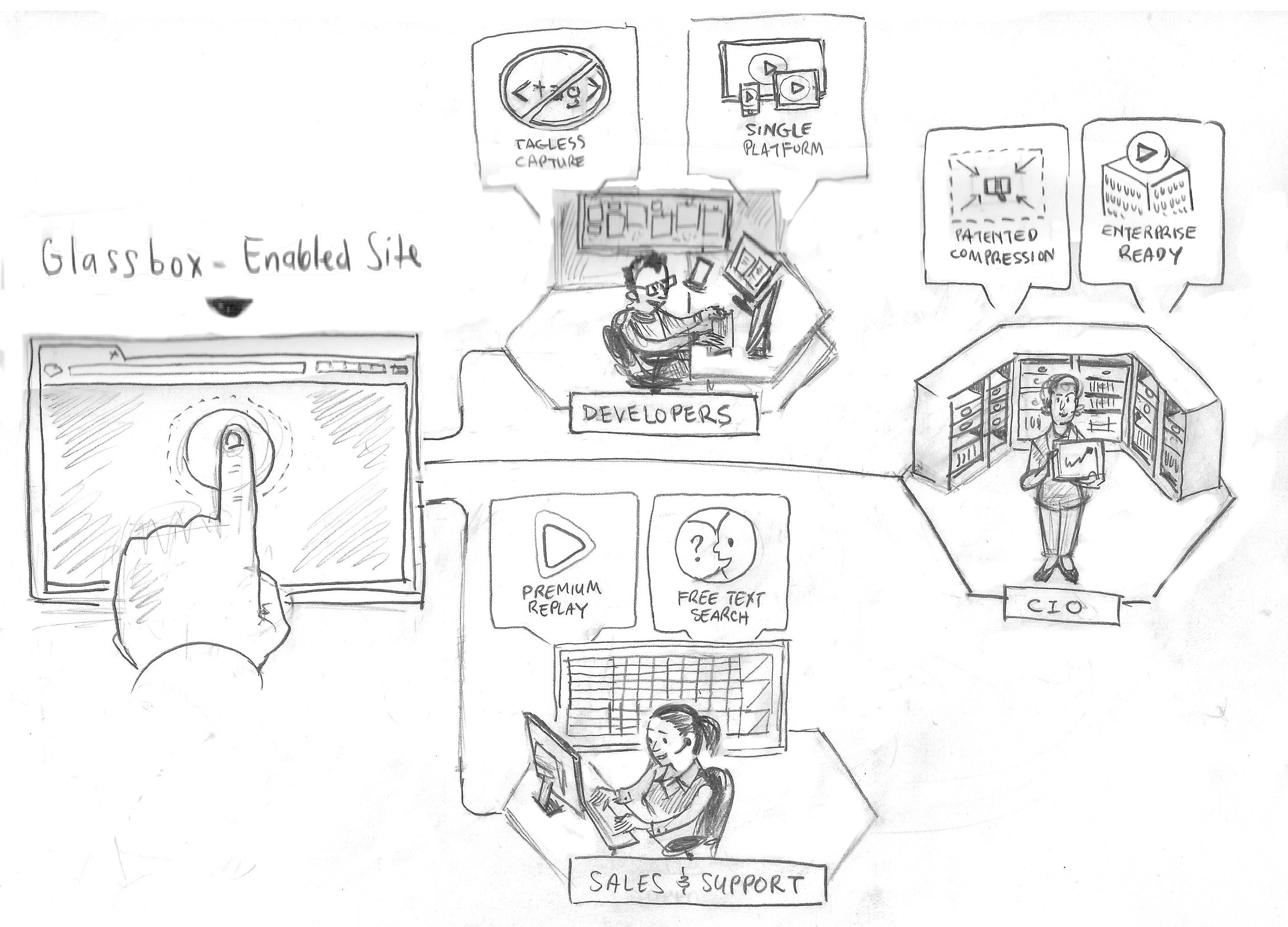
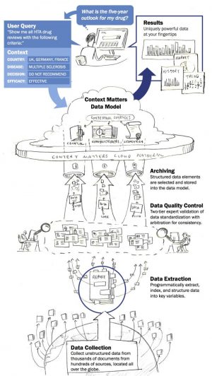
That seems a distant memory for me now and so it should in 2014. At my day job here at Frame Concepts, I am constantly coming to terms with our client’s innovation whether in a startup or Fortune 500 reinventing themselves and after we have had our debate on what the offering REALLY is, its very natural for us to take advantage of a pencil sketch and through iterations (and debates) – to bring the point and value to surface in what we call a positioning pictogram. And then on the tactical level to bring that visual into sales presentations and websites and trade shows and webinars and … well … you get the idea.
He Who Laughs the Last Laugh
I remember my colleagues laughing at me when I left a top-ten brokerage in the 90’s to join the hurly burly world of tech startups in New York’s Silicon Alley and I remember the first startup I worked at had a daring idea about taking brick and mortar retail stores and selling the merchandise on the web with online shopping carts. I remember the incredulous reaction (nobody will put their credit card number online and who would leave the safe world of Wall Street) on all these fronts from my peers (maybe myself also) at these moves and odd offerings. And of course a bit of cliche but time shows what was considered odd is now brilliant if not even banal now.
Don’t You Belittle My Visuals
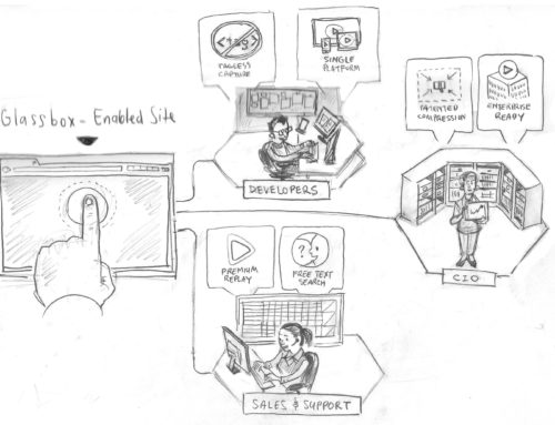
Perhaps I have a thin skin – but sometimes (not so much lately) I bristle when I get the smiles that I suggest visuals done in the right way can enable marketplace adoption. Kind of like Saturday morning saving Microsoft reaction. But I am happy to report the need for visual engagement seems more guttural now and more importantly, it’s BECOMING very normal to see clients advancing their cause with well-crafted visual positioning informed by information design. They are like those business development folk in the startup with a sketch on napkin signing up beta clients (And not a logo with a clever branding line).